
When more and more different types of devices come on the market, responsive becomes especially important to ensure the user experience for websites. However, responsive is such a complicated concept that there is no single tutorial or course that can teach you everything about it. The best way to learn responsive website design and development is to learn by doing actual work. At iPullRank, a cutting edge digital agency, we deal with very different client requests, thus I have the chance to encounter different types of responsive problems. Those experiences have taught me a lot, and here are some of the takeaways I’d like to share.
Set Your Responsive Goal
Nowadays everybody is talking about responsive sites. The general concept of this term, “responsive,” means optimizing the web browsing experience for different screen sizes and devices. To actually reach this result, there are 2 popular approaches – Responsive web design (RWD) and Adaptive web design (AWD).
While you can find a detailed explanation of those two online(here is an article from UXpin), but I’d like to make it more easily digestible with a metaphor:
RWD is like a bottle of water, it’s fluid. No matter what the shape of the container, you can always pour water into it and make it fit the shape. AWD is solid, so in order to make it fit into different shapes of the container, you need to know those containers first, and then make separate pieces that each can perfectly fit into one container.
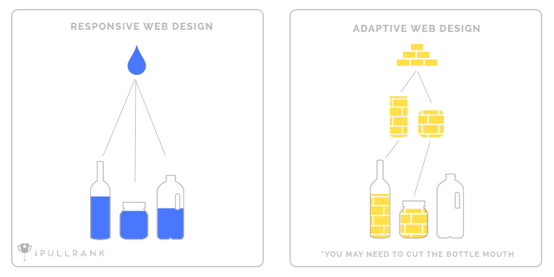
While each method has different responsive goals, RWD is trying to account for almost all situations, whereas AWD is trying to make the perfect experience for certain situations.
Which one is better? My answer is in most cases is RWD. As you can see, it can perfectly fit into different use cases without predefining it.
So what about the best cases for AWD? AWD mainly has two advantages. First, it loads faster since it only loads components for the specific use case. Second, if you have a site which is not RWD, and it’s too much work to convey it to a fully RWD site, then you might want to use AWD to give it a mobile or tablet version.
We recently built an interactive experience City Wars for which we picked RWD. In this case, our goal is to make it usable for all cases. Our reasoning is that City Wars is meant to be a sharable interactive experience. Users are not looking for a piece of information, but for the experience itself, which is unlike an informative website where users may tolerate bad UX as long as they can get the info they want. Therefore, there is no way we could compromise on user experience.
Another reason is that City Wars has a very diverse target audience – they could be Star Wars fans, people who are looking for a property, or random social network users. Therefore, the predefined use cases for AWD would require a lot of research.
Can RWD ensure that we can give our users the best experience every time? It depends. Even within RWD there are 2 approaches. The general approach adjusts the site according to the users’ window size when it is opened. not only adjust itself to users’ window size when they open the city, but also adjust itself when users resize the window.
The comprehensive approach will need more development, especially for an interaction and animation heavy site like City Wars, because a lot JavaScript is involved. JS draws things or arranges things usually based on the current window size.
Mobile Should be Considered at the Very Beginning
Everybody knows that mobile is important. According to Statists, in 2021, the time each adult users spends per day on digital media is 8 hours and 5 min. 3 hours and 15 min of that time on their phones according to Exploding Topics. Google has also stated that in 2015, “more Google searches take place on mobile devices than on computers in 10 countries including the US and Japan.”
Those statistics show the importance of our attention to mobile and has a huge impact on web design and development. One main takeaway from this trend is the mobile first design approach. It can be simply explained as, design the mobile version first, then when it comes to desktop, add more components that make it work better with desktop. This approach encourages people to think about the core elements of a website and keeps the unnecessary parts away from mobile in order to build a better experience. This approach is opposed to the general desktop first approach, which is to design everything for desktop first and then reduce features for mobile.
The mobile first approach is widely accepted, however, my opinion is: don’t always take the mobile first approach.
Web design is about who you want to present your site to and how you want them to consume your content. For City Wars, a mobile-first approach will subtract all the details, animations and illustrations that are essential to the experience. If you start from mobile, the screen size, CPU power, and load speed will limit your imagination. In this case, the experience is the core, not content. So when you finish your mobile design and try to transfer it into desktop, you are adding components to a content-oriented design instead of an experience-oriented design.
In the famous Double Diamonds design approach, there are 4 phases: discover, define, develop and deliver. In the discover and develop phases, it is encouraged to generate as many questions and ideas as possible. The mobile-first approach will put constraints on those phases, and therefore, reduce the creative of the final product.
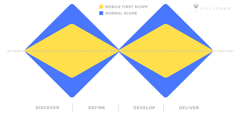
In other words, the mobile first approach will give you a higher chance to have a usable and reliable design, but it is not the best approach for creative-oriented websites.
Nevertheless, even when you don’t use the mobile-first approach, you should take mobile into consideration at the very beginning. I’ve seen some great ideas on desktop that are just not possible to transfer it into mobile. So when you’re finished generating your idea, whether that idea can become mobile-friendly is an important criteria for deciding the final design.
Font Size: PX or EM? REM is the best
Now, let’s talk about the details of mobile design and development. Typography is an essential part of design and development, and size is one of the major attributes. For published content, every reader has the same newspaper and magazine, so the font size is fixed. However, for websites, every user could possibly have a different screen size. Imagine putting a 40px headline into the iPhone – what a disaster. So web design requires the font size to be adaptable to different user environments.
For context, there are two ways of setting the font size in web development – em and px. Em in CSS is a relative measurement; they will change according to the base size they are referring to, while px is fixed. The original reason that people start to use em is that the font with em size is scalable. If you zoom in on a page, the em font will change accordingly, while px font will do nothing (that is to say even your page is scaled 200%, the font will remain small). However, this was fixed by advancements in browser technology a long time ago; px can now be scaled.
And now our question, how does px and em affect our responsive design? A lot of people think em is a better solution for responsive design because of how it works. Fundamentally, EM fonts will refer to a base size.
Let’s say a paragraph font size should be around 16px and heading font size should be around 30px on desktop. The way em works is that the browser will set a base size, for example, 10px (we can specify it ourselves as well), the body paragraph is set to 1.6 em, and the heading to 3 em (simple multiplication).
Now when it comes to the iPhone, because of the significantly smaller screen, our paragraph and heading font sizes should be smaller as well. So the designer sets the base to 5px, and now, the paragraph is updated to 8px and the heading to 15px.
Sounds like EM is awesome, right? It will let the browser or the developer set the base size according to the current screen size, and all the fonts can automatically adjust. But I stuck to px for a long period of time, because there is a problem: Inheritance.
[cc lang=”html”]
Font Size
.font-test{
font-size:10px;
}
.level-1{
font-size:2em;
}
.level-2{
font-size:2em;
border-bottom:2em solid red;
}
[/cc]
Let’s play around with some code a little bit. See the example above, it’s easy to tell that level-1’s font size will be 20px. How about level-2? It’s actually 40px. Guess how wide is the border for level-2? (Yes, em could be used for length, height and etc. just like px.) It’s 80px!
Confusing? Em always uses the closest “font-size” property as the base size. So, for level-1, the base size is 10px, and the font size becomes 20px. For level-2 font, the base size is level-1’s font-size, which is 20px, so level-2’s font size becomes 40px. And for level-2’s border, the base size is actually level-2’s font-size, which is 40px, thus the border becomes 80px. Let’s say we want the border to be 15px by using em. The calculation would be 15/(10*2*2) = 0.375em. Can you imagine if there are even more parent divs? I don’t know how you feel, but I hate this calculation and unknown mess.
Now it’s showtime for rem.
The R in rem stands for “root.” Rem size will refer to a base size too, but the base size will always be the root font size. In most websites, it will be the <html> tag. Let’s review our case by using rem:
[cc lang=”html”]
.font-test{
font-size:10px;
}
.level-1{
font-size:2rem;
}
.level-2{
font-size:2rem;
border-bottom:2rem solid red;
}
[/cc]
Now, no matter level-1 font, level-2 font or level-2 border, they will all have the same size, because they are referring to the same root. In this case, I didn’t set the HTML font-size, so it will use the browser’s default setting, which is usually 16px. So 2rem equals to 32px.
I do suggest that you set the <html> tag to font-size: 62.5%. This will set your base size to 10px in most cases (16*0.625). So when you are trying to set font-size with other components, it will be a lot easier (Your ideal px size will always be something times 10).
Why not set the <html> font-size to 10px directly? Because this will prevent users from changing the default settings of the browser font size, which will cause accessibility problems for some people.
Not only can you use rem for font sizes, but also it also works for things like padding and border.
Responsive font size is a good way to ensure the readability for your text elements on your page. Especially for those text-heavy pages like ebooks. Here is an ebook we built recently for DocSend, you can play with it to see how rem displays the magic.
Media Query Break Points
A common question about responsive design is: Which breakpoints should I use? People keep asking this question, because every year, more and more new devices come on the market with different screen sizes and resolutions.
There are generally 2 approaches. The first one is to target for the screen width. This is the general approach for frameworks like Bootstrap. The second approach is to set breakpoints according to your design. If there is a container which has a width of 1020px, then there should be a breakpoint around 1020px.
Those 2 approaches are both good, and the best solution is to combine them. The design-centered breakpoints give you flexibility on your design. The typical breakpoints won’t become constraints on your layout, and therefore the new design can most likely be generated. This approach is super helpful when building an interactive experience since it lets you arrange your content in the way that best serves your purpose.
The device-centered breakpoints, on the other hand, will help you to define your main interaction methods. When it reaches the tablet breakpoint, you will know that touch, instead of the mouse, is the main way of interaction, and thus the experience needs to be optimized as such. When it reaches the mobile breakpoint, you will know that the CPU power and RAM will not be as powerful as a desktop, thus you may want to reduce some animations and downloads.
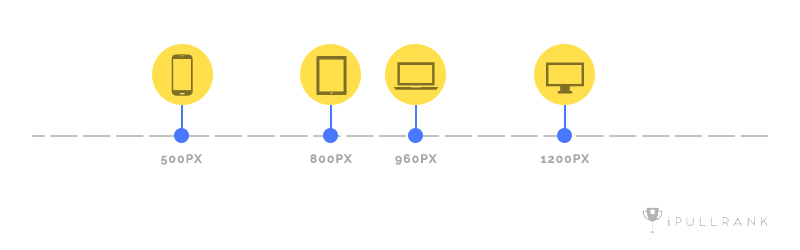
The image above shows the typical device breakpoints I use. If you insert design breakpoints anywhere between those devices, then you will get your comprehensive responsive breakpoints list. Notice that, if you are using a front-end framework, you may want to stick to the framework’s breakpoints as device breakpoints.
There you have the first 4 things I learned about responsive website. In the second half of this series, I will cover how to test responsiveness on your computer, how to optimize your website for touch, how to reduce performance burden on mobile and how to test. If you’re curious about any of these topics, please stay tuned for part two!
Need expert help with optimizing your Mobile User Experience and improving your buyers’ journey? Contact Us!


