
In the first article, we talked about the goal of a responsive website, how to take mobile into consideration, responsive fonts, and media queries. To review my previous post on these topics, check it out here.
In part 2, I will share four of the latest insights I’ve gained from recent responsive design projects.
Responsive Images – Srcset will meet most of your expectations.
Images are essential to any website. Therefore, when it comes to a responsive website, it’s important that your images are responsive too.
The goal with your images is to ensure that they will change size according to different screens. Thus, it will always fit properly into the span of the page. When building your responsive site, be sure to consider these two points about images:
- Page Load speed matters: When the screen is small, don’t waste time loading an image that is much larger than the screen. As long as an image is clear, use the smallest one possible because it will load faster. Also, resizing a large image into a smaller one will require some processing so don’t waste your time unless it’s necessary.
- Prepare for varying screen sizes: Images that look good on a regular screen will likely look blurry on ‘retina’ displays. If you want to know why a clear image on normal display will become blurry and a common way to address it, I suggest you read these two articles.
To my second point, retina displays have four times the pixels as normal displays, thus the same image on a retina display must be four times larger than an image on a standard display. While a smaller than-required image will become blurry, you might think using a larger one is always preferable. However, then you run the risk of encountering the first challenge of transitioning screens. I suggest that you approach this on a case-by-case basis.
Since we need a way to decide which image to serve based on the screen size and retina or not at the same time, srcset is the way to go.
By definition, srcset means a list of one or more strings separated by commas indicating a set of possible image sources for the user agent to use. Basically, it will associate an img tag with a bunch of different resources, and pick the one that meets the current requirements to display.
The basic syntax of a srcset tag is:
[cc lang=”html”]
[/cc]
To offer further insight, the ‘src=’ attribute is the backup plan or method of graceful degradation. In other words, if the current browser doesn’t support srcset, it will use this image. Let’s skip sizes for a minute, and look at the image URLs that are in srcset. This <img> tag will pick one of those pictures in this srcset. You may notice they all have something like “200w”, this is called “w descriptor”(here is an in-depth review on this). This indicates how wide this image is. For example, if this image is 460px in width, you would enter “460w”.
Now to the magical part, the ‘sizes’ attribute. This attribute specifies how wide this image tag will be in this window. If you don’t list this attribute, then the default will be 100vw,which means 100% of the view width aka the window width. Let’s say you open it on your iPad, and then the window width will be 800px. If you set sizes equal to 50vw, then the image will always take 50% of the view width. In the previous iPad example, it will be 400px. However, most of the time, we use it as a media query. The sample code above shows that, if the window width is less than 640px, then the image will use 50vw. Otherwise, it will use 100vw. The last thing you need to know is a thing called device-pixel ratio, which will be handled by the browser automatically. For a standard screen, this ratio will be 1, for retina, it will be 2 or more.
So, how does the magic happen? The srcset uses the following equation to find its ideal image:
Target view width (depending on the “sizes” attribute) X window width(CSS pixel) X device-pixel ratio = Target w descriptor.
And then it will pick the image which has the closest w descriptor size to the target w descriptor.
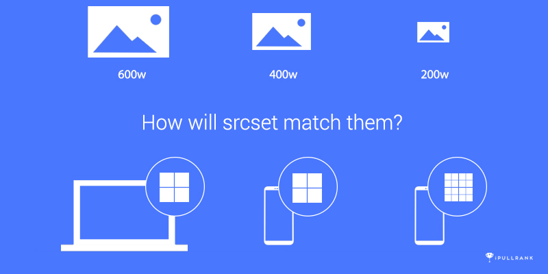
To understand it better, let’s revisit the sample code, and imagine the following situations:
[cc lang=”html”]
[/cc]
- You open a webpage with the above img tag on a non-retina desktop monitor, and the window is 1200px wide (this is in CSS pixels). The image tag will use 600px (1200 * 50vw(0.5)). The device-pixel ratio is 1 here since it’s a normal screen. Guess which image will be picked? The third, cause 600px * 1 = 600w.
- You open a webpage with the above img tag on a non-retina mobile phone (which I don’t see a lot nowadays), and the window is 360px wide. So now the image tag will use 360px(360 * 100vw). The device ratio is still 1. The second image (sample-2x.jpg) will be picked cause 360 * 1 = 360. Which is the closest to 400w.
- You open a webpage with the above img tag on a retina mobile phone and the window is 360px still. So the image tag still uses 360px. However, the device-pixel ratio is 2 now. Now the 3rd image will be picked again, cause 360 * 2 = 720, which is the closest to 600w.
You can tell that srcset is super smart. If the image container (specified by the sizes attribute) is small, it will pick a small image instead of a large one. However, it can change its strategy if it’s retina.
But it’s not the definitive solution because there are cases when you may not want to use it like lazy loading, or if you want the images on small screens to be different (not just smaller) via the <picture> tag.
Don’t Be FrameWork-Shamed.
A lot of designers and developers want to create original things that can show their uniqueness. Therefore, they might be reluctant to use front-end frameworks like Bootstrap. I’ve also heard of people saying that things created by the same front-end framework will look alike (which, is not inherently true).
No matter why you don’t want to use a framework, there are way more reasons you should and responsiveness is a major one.
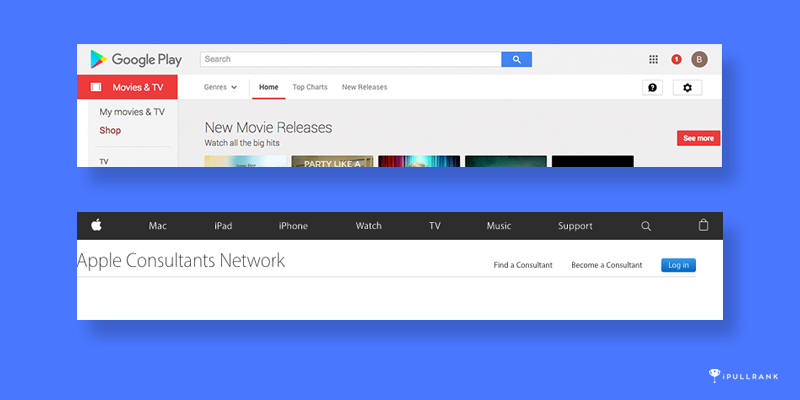
A responsive site is hard to build. It is hard because it involves balancing many components. There could be hundreds of different resolutions, DPI, window shapes, browsers, operating systems, use cases – you name it. With all those things in mind, it’s nearly impossible not to miss a detail if you do this by yourself or as a small team. Even tech giants like Google and Apple, still make mistakes on when it comes to building responsive sites. For example, you can see how things are not properly aligned in the following screenshots.
So, you need help, and you need extra hands and eyes to take care of stuff that is not on your radar. Frameworks do just that.
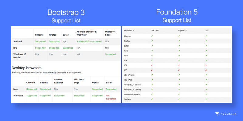
Those components of frameworks like Bootstrap and Foundation are tested by both their team and hundreds of thousands of people who use them. So a lot of bugs have already been eliminated. Even if you still find some, you can easily find people who encounter the same problem in the community.
Another thing frameworks can help with is browser compatibility. The cross-browser performance problem is not unique to responsive development, but responsive development makes it harder.
Mobile Users Don’t Have a Mouse
Ok, we all know mobile users use the touch screen instead of the mouse, so what exactly does this mean?
Precise interaction is hard
When building responsive sites, a lot of times we are just trying to “fit” everything into different screen sizes. Once it fits, we think it’s responsive. However, just squashing things together and making them smaller will often be problematic.
Look at the footer of Kickstarter.com on a mobile phone. It probably would be fine if you have a phone that is 5.5 inches or larger, however, when I was trying to click on items in this footer on my 4.7-inch iPhone, I had to pay close attention. If I move my finger too fast, I may click on the wrong one. Even if I move it slowly, when my finger is above the item I want to click, my finger will cover 3 items, sometimes I wonder which one I‘ll actually hit.
In comparison, the Microsoft.com solution is a lot better. Instead of presenting everything up front, it uses an accordion menu, which hides secondary items. So each first-level item can have a larger margin between each other.
For menus on mobile, you can make each item relatively small and have a huge margin between each other. Or, you can make the item itself huge, for example with huge padding or by making it a button. Both of those 2 ways can address the imprecise problem of touch. However, this is just one aspect of the whole thing, when developing the mobile version of the site, you should always consider if the user can precisely do what they expect.
No Hover
On mobile, there is no hover state. Therefore you shouldn’t do anything that relies on hover to reveal information.
For example, I saw menus that if you click on an item, it will go to the page of that item, and if you just hover on that item, you will see its child items. If we don’t account for this and use this menu on mobile, users will never see those child items because they cannot hover and when they click on the main item, the page will redirect to the target instead of opening the child menu.
Another example is that some sites really rely on their images. So every piece of content is presented as an image, and when you hover on it, it will show you the title and other information. For users, this is an uncertain and confusing experience on mobile. “I saw a beautiful featured image of an article, but what exactly is this article about?” The final result will be a lower click-through rate, page depth per visit, and time on site.
Test it
As I mentioned before, responsive website development is hard. It’s nearly impossible to not miss many details. So you need to keep testing and identify problems.
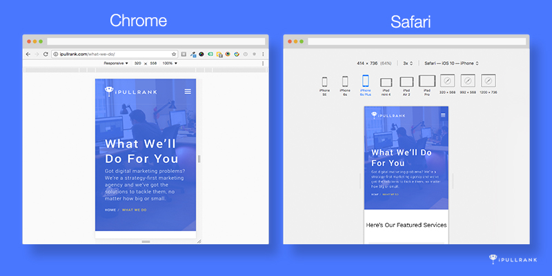
The most common tool people are using is Chrome development tools. This tool will not only emulate the different screen sizes but also the user agent and the no-hover interaction. Another tool I personally use sometimes is Safari developer tools. You may ask who uses Safari? Well, a lot of iPhone and iPad users. This tool we help you easily inspect between different Apple products.
Both of those 2 tools have remote debug modes. Which will allow you to open the webpage on your actual mobile phone and then debug on your computer. Actually the remote debug mode is important because the responsive emulation in both Chrome and Safari can not 100% reduplicate the behavior of a real mobile use case. Firstly, it’s still using the desktop version of the browser engine, secondly, some behavior is unique to mobile OS (like the expandable footer toolbar and address bar).
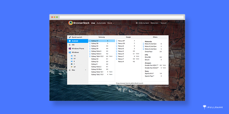
What if you don’t have the right phone for remote debugging or you want to do remote debugging on different phones? Buying different phones and switching between them will be a lot of work. So a cheaper and easier solution is BrowserStack. BrowserStack actually uses an emulator to give the whole experience of a mobile phone including both the browser and the operating system. And for most of the phones it provides, you can conduct mobile debugging as well. Another feature I really like about Browserstack is that it has a “Screenshot mode”, which will generate screenshots on different devices and screen sizes at the same time. So you don’t need to open the same page over and over again.
BrowserStack also provides you the ability to debug on different desktop browsers and operating systems, which is really important to website development.
However, just like responsive development itself, nothing is perfect. Since BrowserStack is not running locally on your computer, it actually projects the screen of an emulator on their side, so it can be slow sometimes. My suggestion is that you use Chrome or Safari debugging tools first, and when you cannot find new bugs, put the page into BrowserStack to double-check.
Final Words
All the things I mentioned are from my real experience, the purpose of this series is to help designers, developers, and marketers avoid the same traps and save some time. However, as I said before, a responsive website is hard, in design or development. So the most important thing is that you have to keep working on it. You need to keep searching for new methods of planning, new ways of building and designing, and last but not least, keep testing.
For me, testing is always the most important and helpful part of building responsive websites because it is so complicated. The only way to figure things out is by testing. So if you don’t remember much of what I said, that’s fine, but never forget to test!


