Pivot tables are one of Excel’s best and most powerful tools. Very often, beginners may find them to be intimidating and difficult to create based on their level of expertise in Excel.
Unfortunately, pivot tables also have a notorious reputation for being complicated. The good news is that creating a pivot table is much easier than you’ve been led to believe.
A basic pivot table will only take about a minute to create and get you started on exploring all your small and simple datasets as well as large and complex rows of data.
What is a pivot table?
A pivot table is a data summarization tool used for data analysis and data processing. Essentially, a pivot table is a summary of your data in a chart that makes exploring it easier for reporting and analyzing trends.
They allow you to do quick cross-tabulation, where you can create dynamic aggregations, slices, and filters from datasets. Unlike static tables, pivot tables allow you to use your data as an active source without having to write your own formulas. With them, you can summarize, sort, group, sum, count, and average data, to go from a data-dump to a dashboard created from pivot tables.
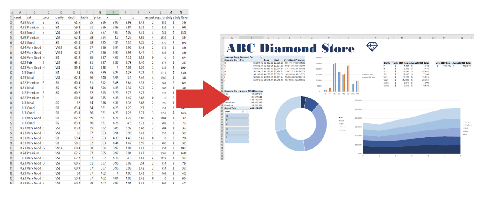
A pivot table allows you to create tables separate from, yet still based on your original dataset. These external tables can be arranged in many different ways. In fact, the “pivot” of pivot tables was derived from the dynamic nature of the table, which allows you to pivot or rotate data in the table in order to view it from different perspectives. Your original dataset is not altered in any way, instead you reorganize it to uncover useful information.
How do you create a pivot table?
Creating a pivot table can be done with just a few clicks of your mouse. For this example, we’ll be looking at a diamond inventory that you can download to practice with.
To get started, click on any cell in your dataset. Navigate to the ‘Insert’ tab, then click ‘PivotTable’ within Excel (for Google Sheets: ‘Data’ > ‘Pivot table’). If you do not see the ‘PivotTable’ option, click on ‘Tables’, then select ‘PivotTable’ from the group.

Once you select ‘PivotTable’, a window will appear. Selecting any cell within your data when inserting a pivot table automatically sets the full range as the one you will be working with. So make sure you don’t have any rows that are completely empty, otherwise Excel will only recognize part of your data as your desired range. If your range is good to go, click ‘OK’.
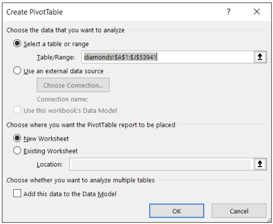
*Note: The default option when creating a new pivot table is to place it within a new worksheet. Select ‘Existing Worksheet’ and click into the ‘Location’ box to be able to select the location you want.
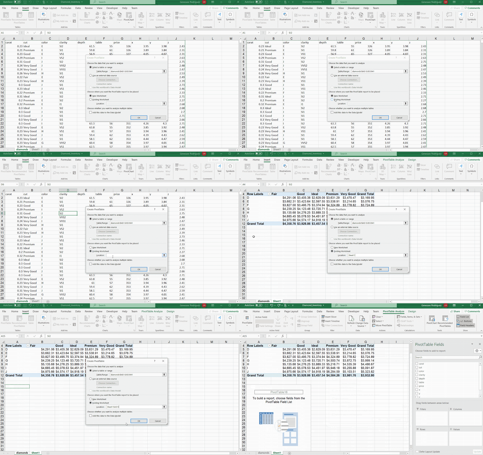
Now that we have a blank template, we can start building our pivot table. To start building, we have to choose fields to include in our table from the Field List. Let’s get familiar with it.
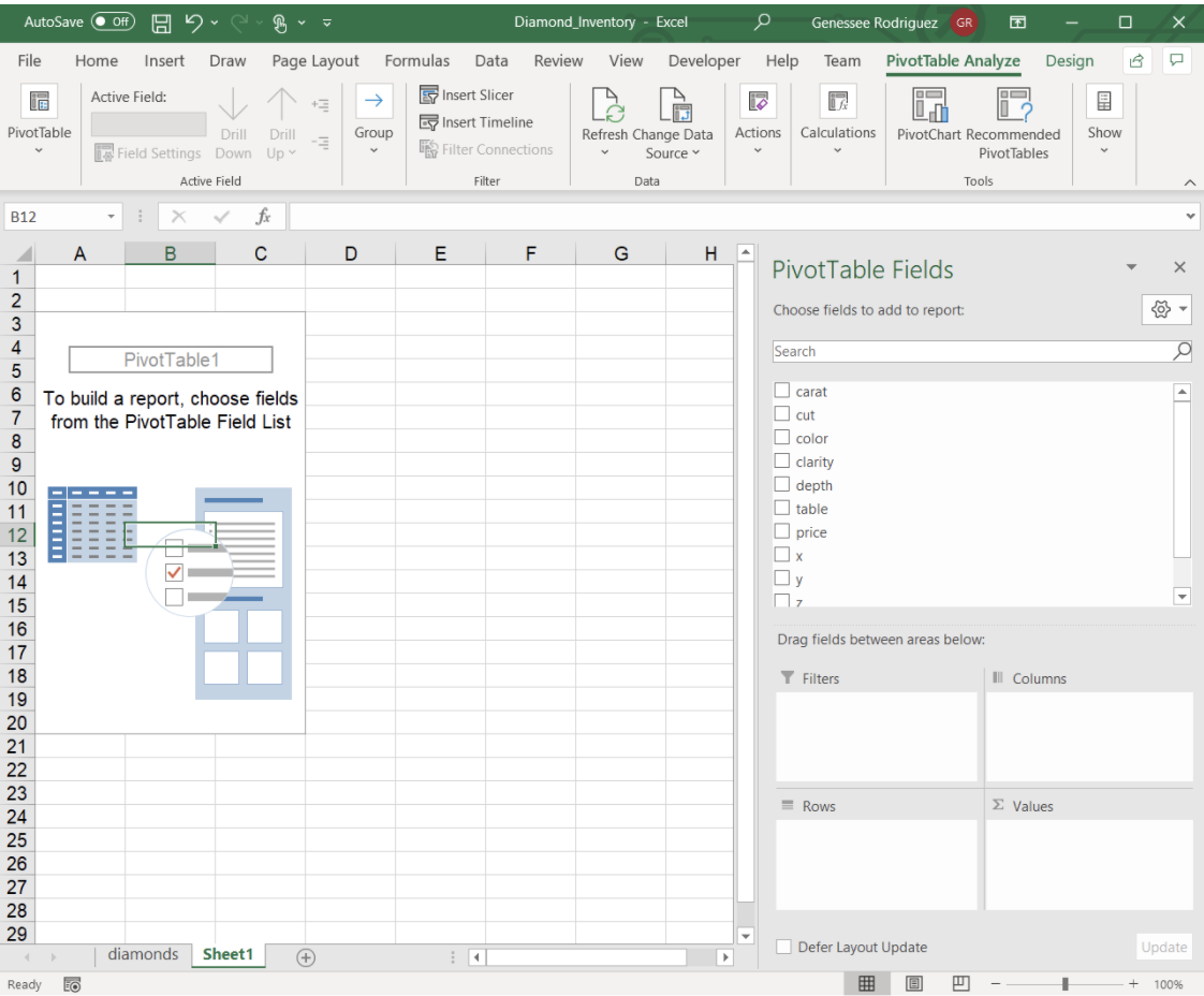
Pivot tables have four primary components: filters, rows, columns, and values.
- Filters: Which data should we include in our pivot table?
The best way to use this feature is by filtering out any data we don’t want to include. - Rows: What unique data values do we want to have as rows in our table?
These are values that must exist in the dataset. - Columns: What unique data values do we want to have as columns in our table?
These are also values that must already exist. - Values: These are the values that will be in the cells of our table.
To create them, we’ll have to tell Excel how we want them aggregated using the aggregation functions.
Depending on the type of report you want to build out or what you want to analyze, you can play around to see which fields are most appropriate. To add in our fields, drag them into the boxes in the Field List.
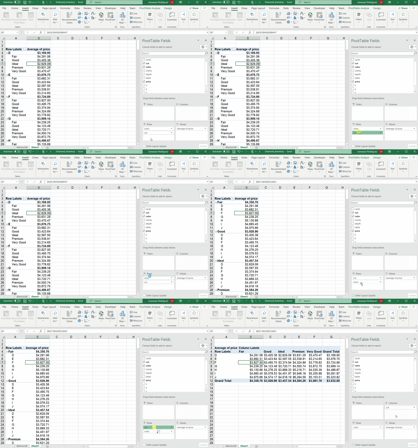
If we wanted to see which the average price per cut, we would drag in ‘color’ into ‘Rows’ and ‘price’ into ‘Values’.
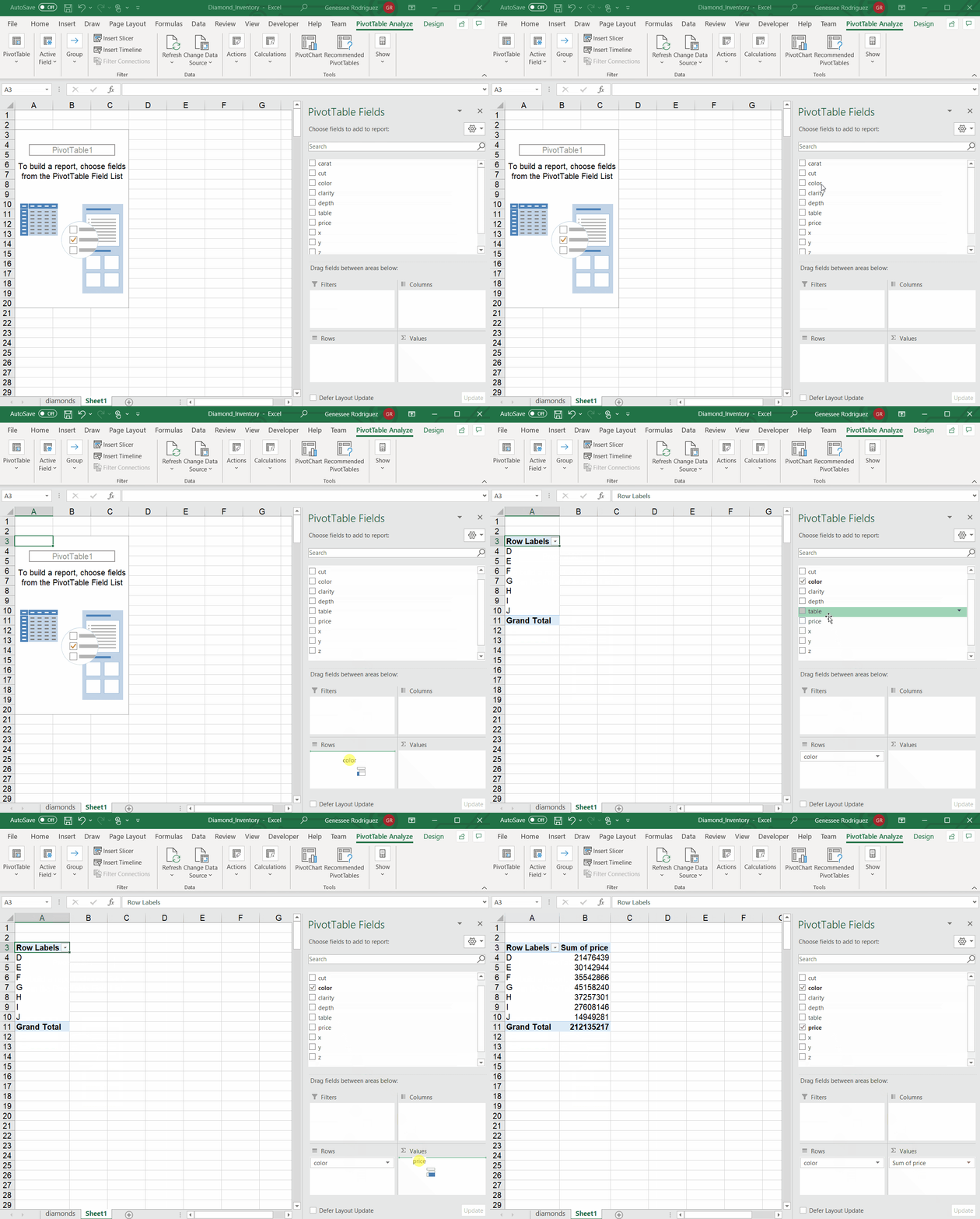
Excel automatically aggregated the price values as a sum. Since we want to know the average price per diamond color, we have to change the aggregation functions. To do so:
- Click the dropdown arrow in the added field within the ‘Values’ box and select ‘Value Field Settings…’
- Once there, you can choose the type of calculation that you want to use to summarize data from the select field. In this case, we would select ‘Average’.
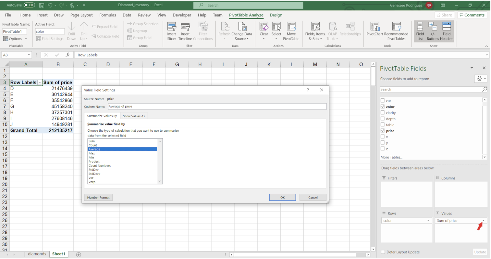
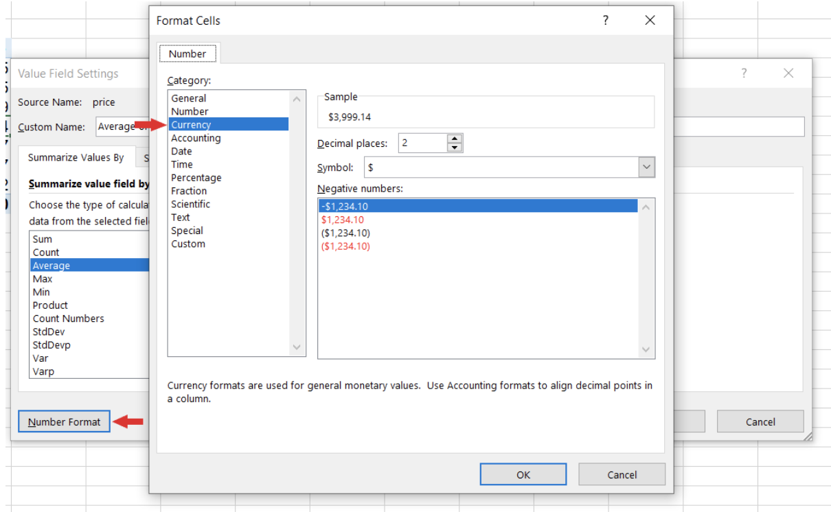
This will properly take the average, but let’s make sure our formatting is correct. These averages are dollar amounts, so go in the same pop-up box, click on ‘Number Format’ and select ‘Currency’ and your pivot table is now complete.
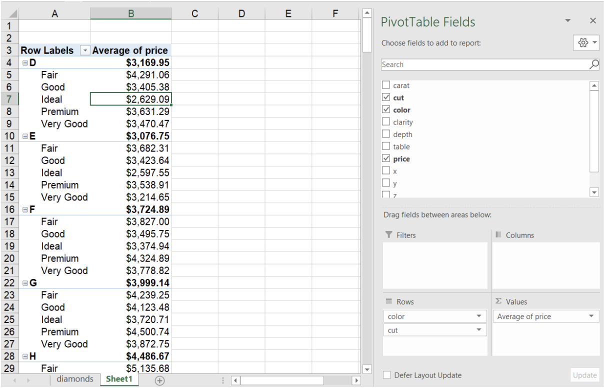
But what if we want to add a secondary dimension to analyze? Simple. For example, if we wanted to calculate the average price per color and per cut, we just drag ‘cut’ into ‘Rows’.
What if we wanted to see by diamond cut and then color? We just change the order by dragging ‘cut’ above ‘color’ to see the results. It’d also be much easier to parse and compare this data if the colors were down the rows and the cuts were across the columns. Moving ‘cut’ to ‘Columns’ will do the trick.
How do you create a pivot chart?
When creating a pivot table, you also have the ability to create an accompanying pivot chart at the same time. By selecting ‘PivotChart’ within the ‘Insert’ tab or selecting ‘PivotChart & PivotTable’ in the drop down menu, you can follow the same steps from above for creating a pivot table.
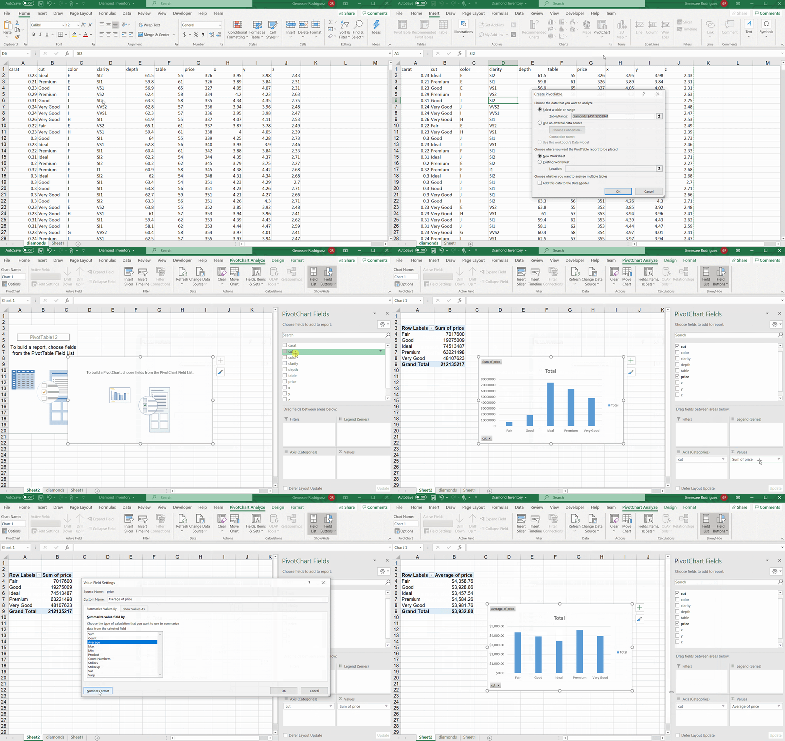
Alternatively, after you’ve created a pivot table, you can click into it and navigate to the ‘Insert’ tab to add in a chart as you would for any other set of data.

What practical uses do pivot tables have?
Now that you know how to make a pivot table and chart, you can make the best use of this skill by creating pivot tables to make sales reports, compare product performance, show product sales as percentages of total sales, segment sales by categories, and even break all these down by date.
Pivot tables are most commonly used with data that requires some aggregation to better understand. While you can do your own aggregations by adding new columns in your spreadsheets, pivot tables are one of the best tools since they don’t require you to write complicated formulas or to create new tables every time you want to organize your data differently.
For many users, getting the best use of pivot tables comes from playing around with different fields and aggregations to see which ones make the most sense of your data. Pivot tables make analyzing data so much simpler and cleaner to work with than a data-dump spreadsheet.
Let us know of other Excel features you’d like us to explore with you like our Excel Basics on How to Use VLOOKUP in the comments below. Also, be sure to check out our Blog and subscribe to our newsletter for more resources from iPullRank.


