
TL;DR
- The mobile version of your website will soon be the only version that Google will index and rank. It’s now or never to get your site mobile-friendly.
- Use Google’s Mobile-Friendly Test Tool to determine the mobile-friendliness of any page on the web.
- Use Google Search Console’s Mobile Usability report to track, monitor, and troubleshoot mobile usability issues across your entire site.
Google made an official shift to Mobile-First Indexing as of September of 2020. Fast-forward to March 2021, and Google’s own John Mueller dropped the bombshell: desktop indexing is to be phased out completely.
“When a site is shifted over to mobile-first indexing, we will drop everything that’s only on the desktop site. We will essentially ignore that,” he said in an interview with Search Engine Journal.
In short, Googlebot won’t be crawling the desktop version of your website anymore. It’s all mobile, all the time. And that has far-reaching ramifications for your search visibility, especially if your site is one of the many with different content (copy, text, links, the whole gamut) being served to desktop and mobile users.
While the sweeping move from mobile-first to mobile-only will shake up SEO, it makes sense. More than 55 percent of global web traffic is mobile, and nine in ten global internet users access the web via mobile.
The takeaway: your site has got to be mobile-friendly. This isn’t about risking a penalty; it’s about protecting your business from complete and total online invisibility.
Here’s how to figure out if your website is mobile-friendly.
Use Google’s Mobile-Friendly Test Tool
Google’s Mobile-Friendly Test Tool is your first port-of-call. Quick and easy to use, you can check the mobile-friendliness of any page on the web (keep in mind that if you’ve implemented redirects, they will be followed by the tool).
If you want to play along, open the Mobile-Friendly Test Tool now.

Copy your URL and paste it into the tool’s field. Hit the big, orange “TEST URL” button. It should take less than one minute for your website to be analyzed.
Help! Google tells me my webpage has unloadable resources
If the page reloads with a warning message referring to unloadable resources, the URL you submitted contains external elements that mobiles – and Google’s mobile-friendliness test – can’t load. That might be images, script files, or CSS.
Here’s a bit of troubleshooting:
- The resource takes too long to load, and the Mobile-Friendly Test Tool gave up. Try rerunning the test. If the error persists, the problem likely lies with your server.
- The resource isn’t where your webpage told Google it would be. You’ll need to update the resource’s URL.
- The resource is only visible to logged-in users. Google’s test accesses your page just like any other anonymous web user.
- The resource is not accessible to Googlebot because of a robots.txt file. Unblock the resource and rerun the test.
Breaking Down Your Test Results
Your test results give you a color-coded “Page is mobile friendly” or “Page is not mobile friendly” diagnosis. If it’s not mobile-friendly, Google will list the usability problems it finds.
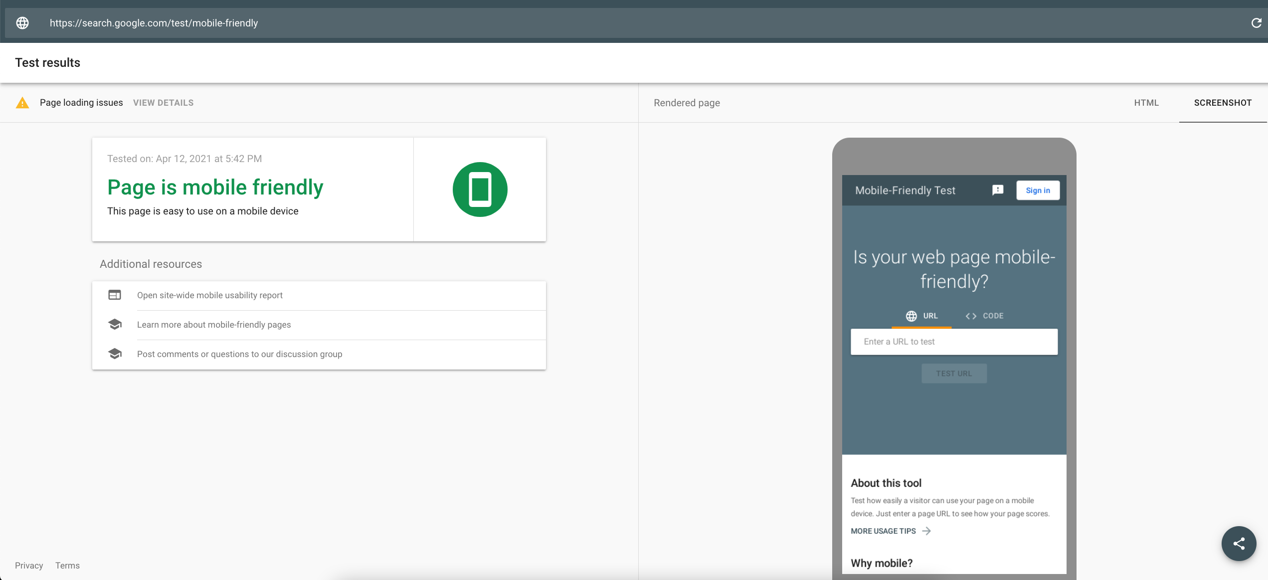
You’ll also see a preview of how the page appears on mobile, which, as an aside, doesn’t refer exclusively to smartphones. Google uses “mobile” as an umbrella term for any small-screened device.
So, your page is mobile-friendly? That’s a start, but there’s more to it.
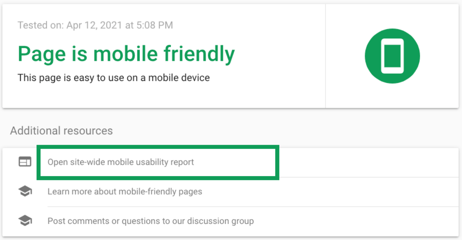
First, remember that this tool only checks the URL you submitted. If you pasted in your home page, the jury’s still out on your blog and about page. Use Google Search Console’s Mobile Usability report (discussed below) to analyze your entire site.
And second, a mobile-friendly page doesn’t necessarily have mobile and desktop parity, a crucial factor as Google moves to mobile-only indexing. Find out how to diagnose content parity issues step-by-step in this article using Screaming Frog SEO Spider and Parito.
So, your page is not mobile-friendly? You’ll see a list of one or more mobile-usability errors:
- Clickable elements too close together. Fingers are bigger and more cumbersome than the pointy edge of a cursor. If your page’s tappable elements are crammed too close together, users won’t be able to tap them without unintentionally tapping nearby elements. Give buttons and navigational links plenty of breathing room.
- Content wider than screen. Your web visitors don’t want to scroll horizontally to read the text or view the images on your site. Content exceeds the screen’s width when a page uses absolute values in its CSS declarations, includes images that are allocated an optimal size, or doesn’t have a viewport. Every page on your site should use relative width and position values, and your content should be set to scale according to screen size. Don’t be tempted to omit chunks of text or images from the mobile version of your site to overcome this error. Remember, Google isn’t looking at your desktop site anymore, which means any elements that exist exclusively on desktop won’t be indexed.
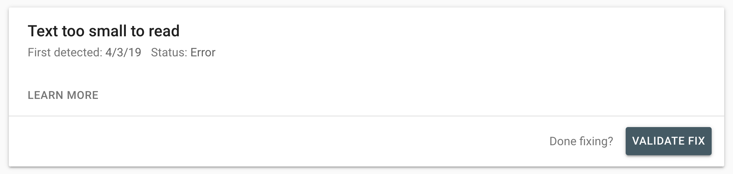
- Text too small to read. Exactly what it says on the tin – the text on your site is so small it isn’t legible. Mobile visitors shouldn’t have to pinch-zoom to read comfortably. Ensure your font sizes are set to scale within the viewport.
- Uses incompatible plugins. Your page contains plugins that aren’t typically supported by mobile browsers, like Flash. Rework your page using more widely supported platforms like HTML5.
- Viewport not set. Viewports are cornerstones of responsive web design that tell browsers how to tweak a page’s dimensions to fit a screen. Your site’s mobile visitors are using devices with a range of screen sizes – cater to this by using the meta viewport tag to allocate a viewport.
- Viewport not set to “device-width.” Another viewport error, but this time, your page can’t respond to a change in screen size thanks to a fixed-width viewport. You’ll need to switch to a responsive design and adjust the viewport to scale automatically according to the visitor’s screen size.
Google Search Console’s Mobile Usability Report
Google Search Console delivers technical analysis and measurement of your website’s performance to help you monitor and troubleshoot errors – including mobile index page errors.
Search Console’s Mobile Usability report shows which pages in your property (i.e., website) experience issues on mobile.
Again, if you want to play along, click “Open site-wide mobile usability report” under your Mobile-Friendly Test Tool results. Or head to Search Console and select “Mobile Usability” under the “Enhancements” menu in the sidebar.
First, you’ll see a top-level graph detailing the number of pages that meet a threshold of mobile usability errors. “Valid” pages, in contrast, have little to no mobile issues.
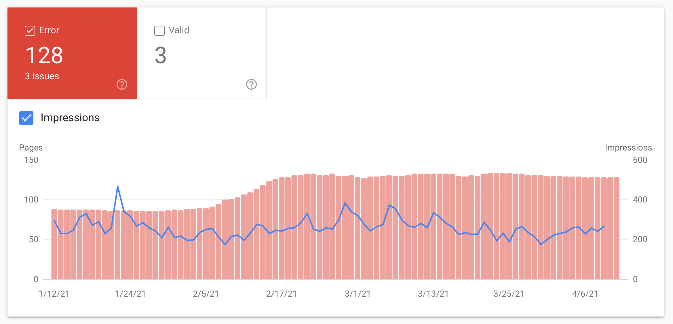
You can tick the “Impressions” checkbox to compare the number of impressions from mobile devices to the number of mobile usability errors.
Scroll down, and you’ll see a list of errors affecting your site.
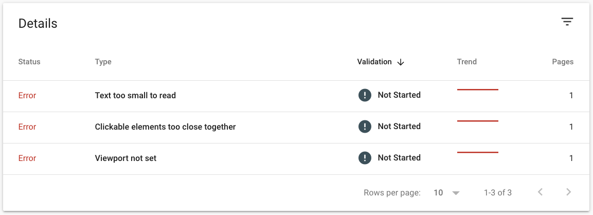
Click on one, and you’ll see the specific pages with that error.
From there, you can also click “LEARN MORE” for guidance on fixing a particular error. After you’ve attempted a fix, click “VALIDATE FIX,” which will trigger Search Console to reanalyze your site. You can then see whether your tinkering paid off.
My Site Is Not Mobile-Friendly – Now What?
The real Mobilegeddon is here, and your short- and long-term business goals depend on your website’s mobile-friendliness.
If your site doesn’t meet Google’s mobile-friendliness thresholds, shoot us a message. Our SEO team can help you navigate Google mobile-first indexing.

- How to Tell if Your Site is Mobile Friendly or Not? - April 22, 2021
- The Ultimate No-Brainer SEO Guide for the C-Suite (CEO, CMO, CTO, etc.) - April 1, 2021
- The Beginner’s Guide to Google Search Console (GSC) - August 13, 2020


