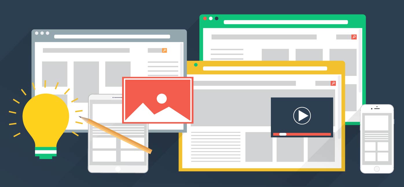
Imagine some websites that you’ve recently visited, and ask yourself, “do they kinda look the same?”. The layout is similar, usually starting with a full-width hero image or looping video with some big tagline overlay. Then follows a CTA and some copy, divided by columns with icons for each one. I have certainly heard my friends complain about how boring websites are these days, especially websites dealing with startups or service driven enterprises.
So, is website design nowadays boring? Yes, and No!
1. Most websites follow the same layout.
Fact 01: Using Online Templates
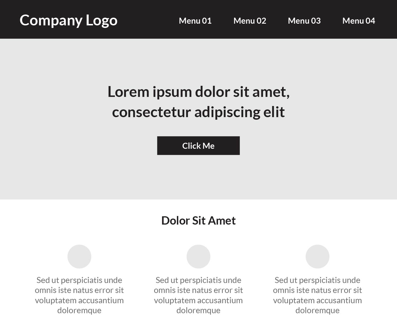
As a business owner, when you have a very limited budget and want to launch your website as soon as possible, but still want it to look professional and beautiful, you turn to themeforest, WIX or TemplateMonster for a web template. The problem with template web design is, most have a rigid layout designed to serve a maximum number of users. In order to generate sales, template designers make the content and layout more general, neglecting the needs of any specific business or individual. This type of layout may attract verticals and business owners looking for an inexpensive web presence, but if you look closely, you will see that most of the templates look like this:
To be clear, I’m not saying that using a web template is always a bad thing. It certainly saves time in terms of development, and multi-device testing (most of the web templates are responsive nowadays). But chances are, there are many other people using the same template, leading to many websites with the same look and feel.
Fact 02: Conversion Matters More Than Appearance
As a designer, I get tired of just looking at marketing landing pages. If you look at the best practices for landing pages, most of them require those features above. It may sound boring and not creative at all, but the truth is, it is the CONVERSION that matters the most.
Conversion is when a visitor to your website takes an action that you want them to take. It could be signing up for an email newsletter, creating an account, making a purchase, downloading your app, or something else entirely. Now, it might sound like conversion is for digital marketing sites that sell products and services, but it is also for other types of websites, such as online portfolios. For example, if you are a freelance copywriter, and your goal is to make clients or recruiters contact you, your portfolio conversion can be for them to fill out the contact form or call you.
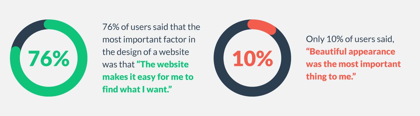
Now, why does conversion matter more than your website layout? Most users don’t care about how fancy a web layout you have.
Fact 03: Balance Between “Innovative Design” and “Responsive Design”
I’m sure there are discussions between developers and designers regarding changing an innovative layout to a “rigid,” “boring” layout to better serve the “responsive web” use case. Responsive web design is the process of designing a website so that its content adjusts appropriately according to the device it’s viewed on. Unfortunately, that also means some of your innovative layouts or effects may not work well on mobile or tablet devices. Finding the right balance between innovative design and responsiveness is a daily task for every web designer.
2. Most websites use flat design.
Fact 01: Flat Design Helps Your Website Load Faster
Every digital marketer knows that search engines reward fast websites with higher rankings. And one of the attributes of a faster website is to have smaller size graphics. Flat design can really benefit this situation, with minimal design elements, websites are able to load faster and resize easily.
The fewer the colors and effects (no drop shadows, gradients, leather textures, shiny surfaces or notepad backgrounds) in an image, the smaller the image size. Huge, high-resolution images may show on your desktop, but may not show on your mobile device. Flat design could help your website load much faster, which increases your ranking in Google’s algorithm.
Fact 02: Flat Design Helps Users Focus On the Content
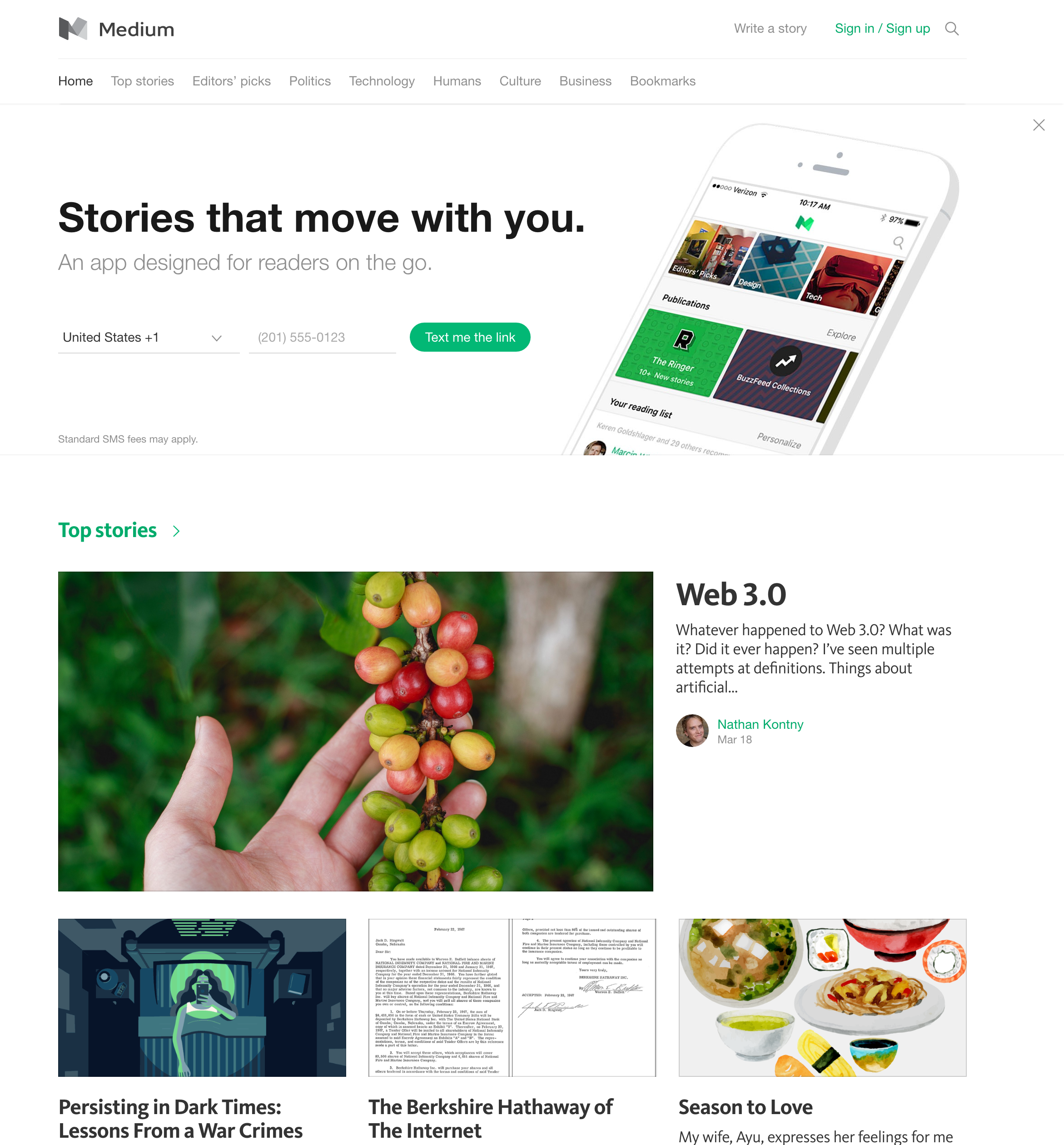
Flat design emphasizes the minimum use of complicated elements and is focused on a use of simple shapes, typography, and flat colors. Flat design is about Minimalism; you can see how popular it has become in recent years. Due to the minimal visuals, users can focus on the content of your site without being distracted by any fancy images. After all, it is your content and product that users care about more. Medium is a great example of how flat design helps users to focus on the content.
3. It just doesn’t feel as innovative and creative compared to web design back in 2000.
Fact 01: Web Design Is More Mature Nowadays
It is true that web design seemed very innovative and creative back in 2000, because at that time, UX best practices were limited.
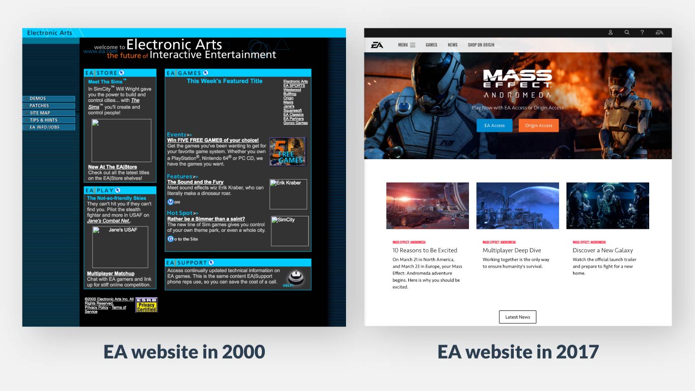
Back then, every web designer tried to play around with the web, and create a unique website. It was the heyday of Flash in web design, and further innovation empowered web designers to integrate animation and video content. Social platforms’ rising and web platforms’ forming give us a sense that we are living in a creative and innovative digital age. But with more and more design thoughts put into the web design fields, and user experience being emphasized, again and again, web design became more mature. Therefore, it is reasonable that sometimes we don’t have a fresh feeling towards it.
Fact 02: Form Follows Function
The design form (aesthetics, interactions etc.) of your website should be based on its function or purpose. I have designer friends that complain about how boring websites look nowadays, and how much they missed the websites back then because there were more dynamic animations and cool sound effects. Sometimes I will agree with them from a “romantic” perspective, but the truth is, all of these cool effects could be a distraction if it doesn’t serve your site a purpose. After all, you are designing the website for the people who will use it, not for yourself.
Fact 03: Creative Innovative Sites Still Exist And Will Be Increasing
Let’s face it, there are more business and consumer sites nowadays compared to 2000, but it doesn’t mean that there are less creative innovative sites. Take a look at the AWWWARDS, THE WEBBY AWARDS and FWA, you will find out there are organizations that encourage passionate designers to craft functional and innovative websites.
Case study of innovative web experience
1. Layout
Examples: Tam Tam
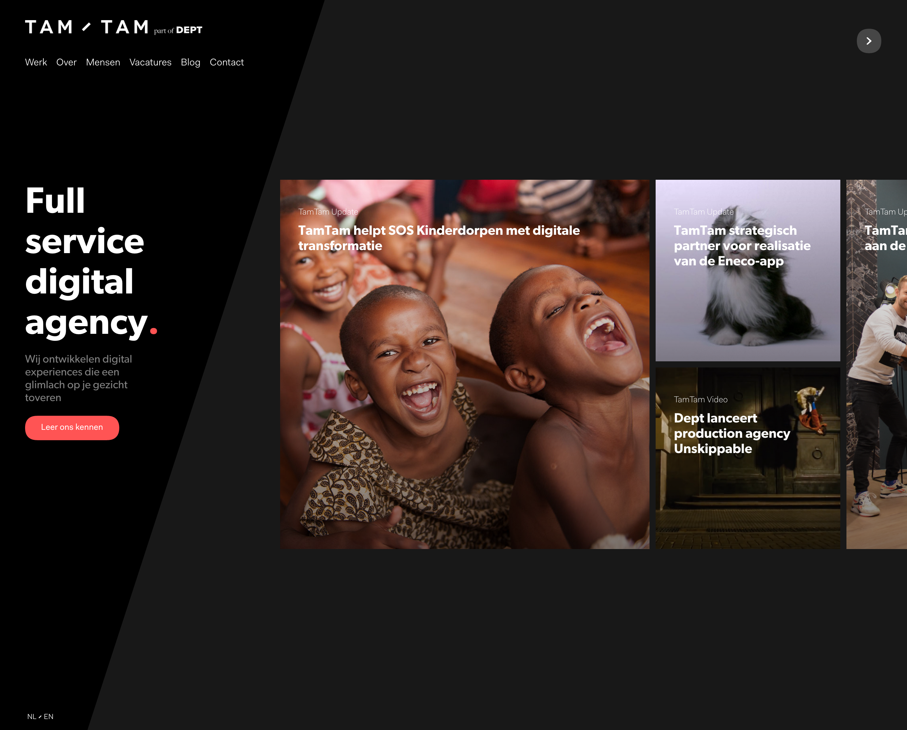
Tam Tam is a full service digital agency based in Europe. Their home page layout is different from the most of the websites online. Instead of scrolling to view content vertically, it shows content horizontally. Although Horizontal designs are not for every type of website. Websites like portfolios or photo galleries can really benefit from it, but not so much with word-driven sites like blogs. It also isn’t suited for older audiences because of its innovated way to interact with the site.
Tam/Tam is a creative digital agency, so in this case, this design fit because it can be an extension of their art and says a lot about their brand, which is quirky and bold. Instead of showing a hamburger menu on top corner, they put it on the left side and keep menu items always visible to their users.
2. Navigation
Examples: Signes du quotidien
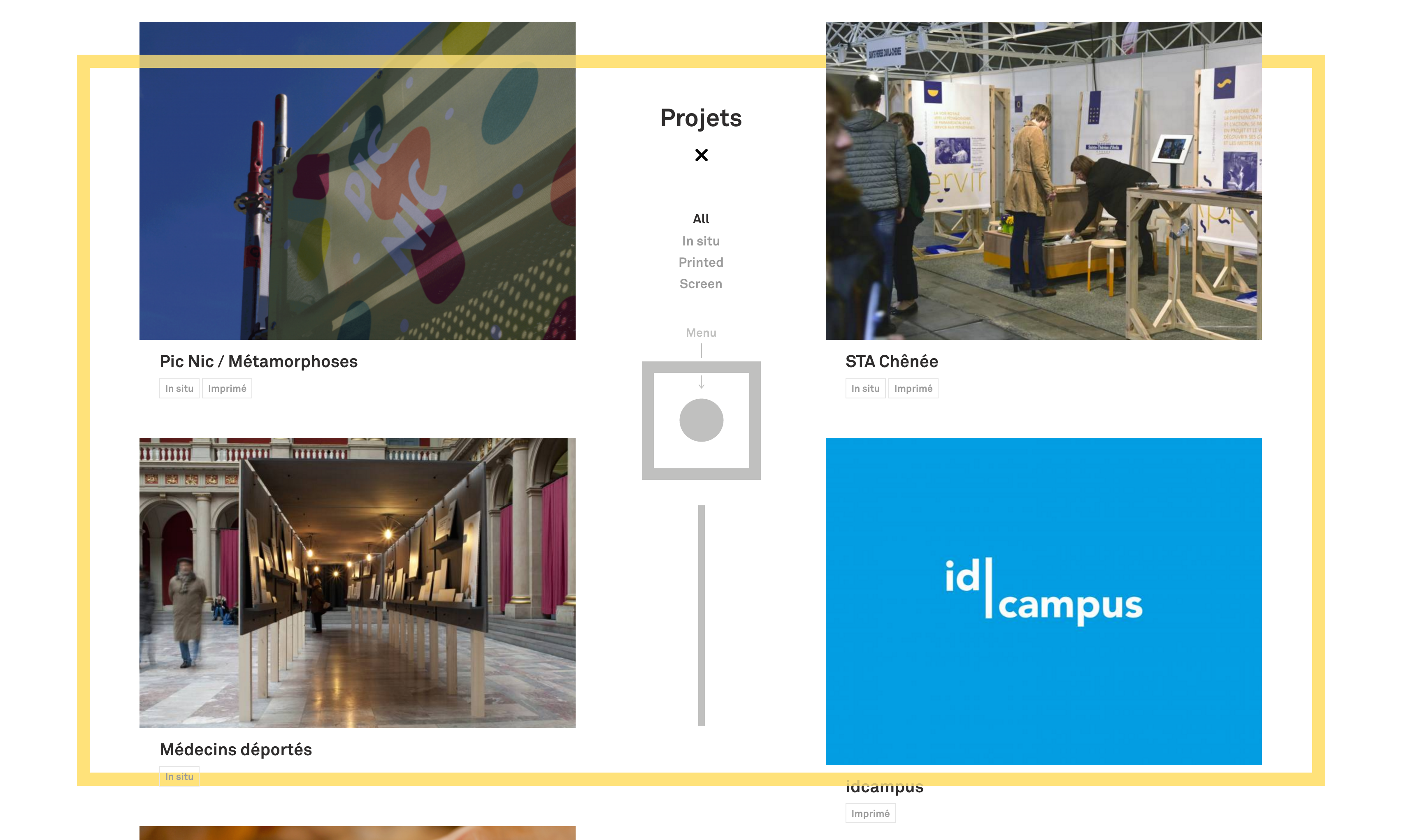
“Signes du quotidien” is a website of a graphic design studio. It has a very unique navigation system that you probably haven’t seen it before. Their site has four navigation items: “Projects” “Mail” “Opening” and “About”, the way it presents the menu is gamified, users have to drag and drop one of the navigation items into the menu box to view the page content. Surprisingly, it also works well on the mobile devices because of its responsiveness.
It’s a little dynamic compared to a traditional menu, but considering it only has four navigation items, the interaction doesn’t distract users that much, instead it speaks to the brand creativity and make it more unique. If you have a much more complex navigation system, I don’t recommend that you apply this interaction, after all, one size can’t fit all. If there’s anything that can be improved, I would say the indication for users to drag and drop the menu item can be larger and more prominent.
3. Interaction
Examples: Nike -15 Years of SB Dunk
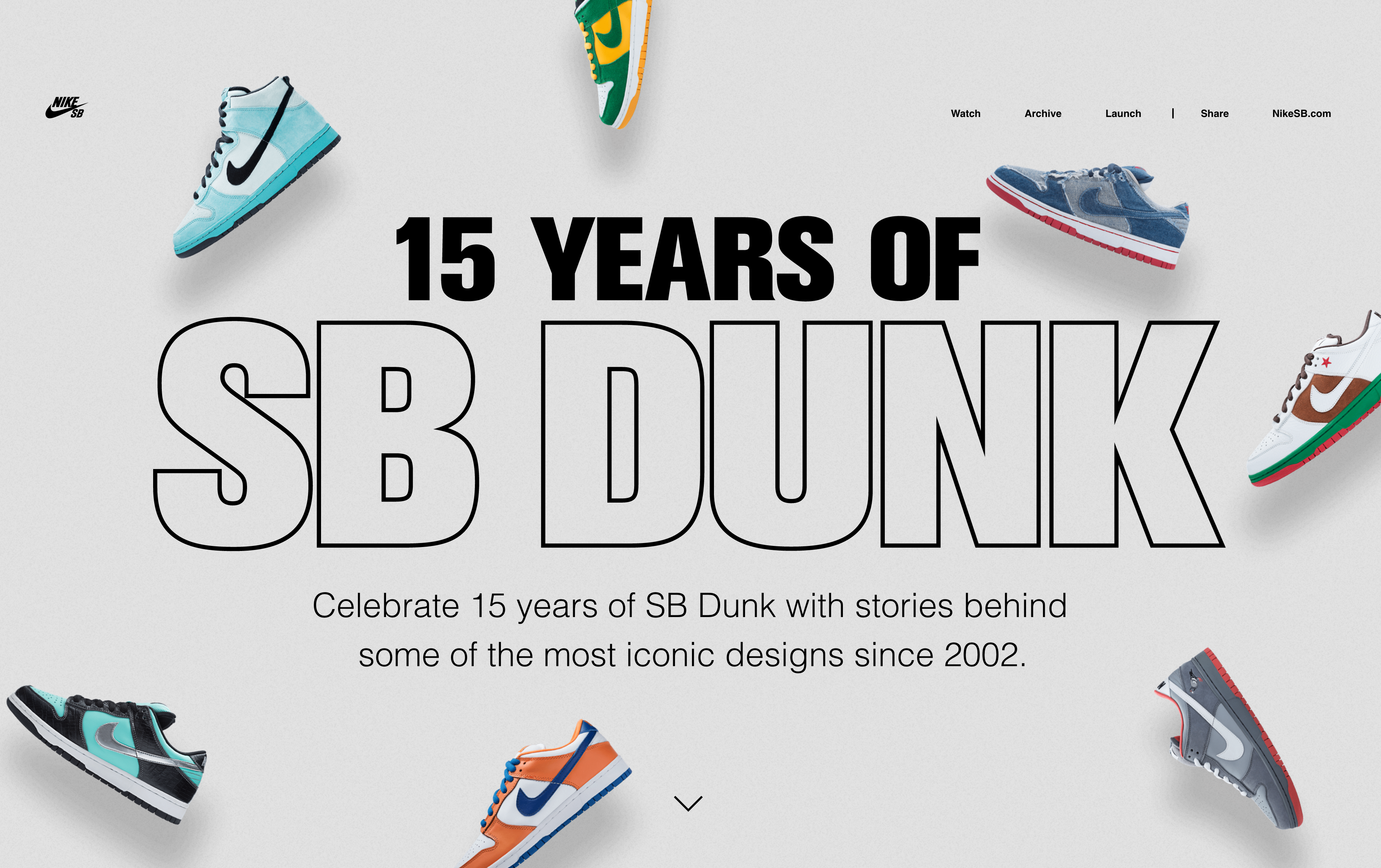
“15 Years of SB Dunk” is an interactive experience that Nike created to celebrate 15 years of SB Dunk with stories. The interaction of this site is very unique, it generates a delightful feeling for users to switch between different products. The transition animation is so smoothness and timely, and create a 3D spatial sense for users when they interact with it. In interactive design, a delightful and meaningful animation is very important.
Here are three principles to help you decide whether your animation is good or not.
- It should convey a meaning to the users and not distract them.
- It should tell the visual hierarchy of your design elements.
- It should create a delightful feeling and make your users engage with your products.
Implementing delightful animation to your web design can be innovative, beneficial but hard, next time when you considering adding fun interactions, asking yourself is your design match the three principles above, if not, then it’s time to redesign it.
4. Aesthetics
Examples: Legwork Studio
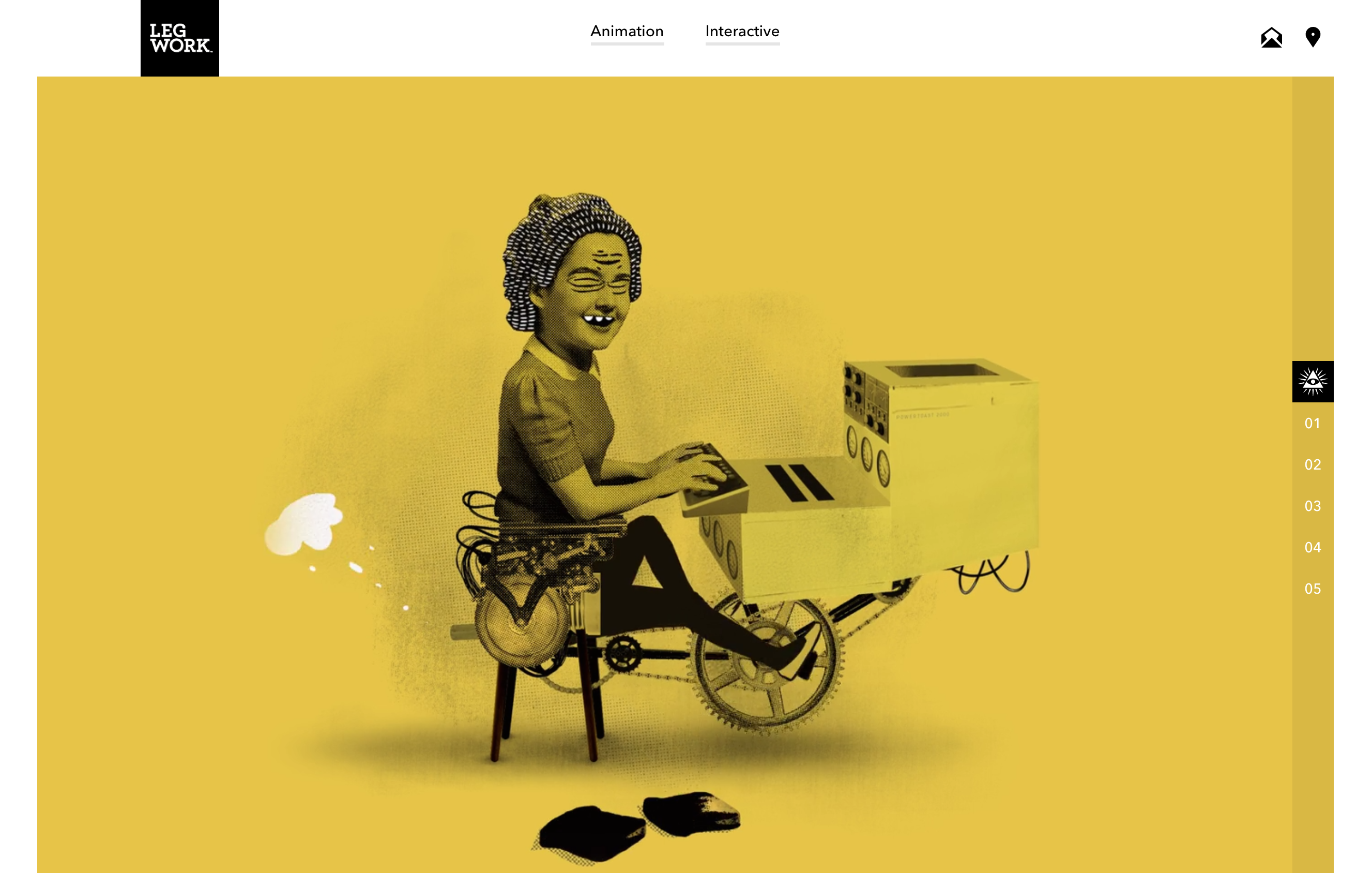
“Legwork Studio” is an independent studio from Denver. They create animation and interactive experiences with brands and agencies all over the world. Their site visual is very different from most of the design studios, it combines realistic photography, fun doodles, and put a color overlay on top. You can really feel their quirky, fun, creative brand personality through it.
Aesthetics of your website can really influence your users. It should tell your users of what your brand is and does. When you are creating a creative and astonishing visual for your site don’t forget your target audience, for example, you can’t use the same style of the visual from the “Legwork” and apply it to a finance company.
Conclusion
Web design should be more about innovation and creativity. Just like any other design, its purpose is to serve the audiences’ need. Therefore, criteria like usability, branding, and conversions definitely limit the creativity, but a good designer can innovate within those limitations. Web layout, navigation, interaction and aesthetic are a good start to differentiating your web designs!
- Not Your Grandma’s Template: Innovative Design for Your Website - March 23, 2017
- UX/UI Checklist for Web Design - January 18, 2017
- Designer and Developer Collaboration: Practical Advice for Efficient Communication - March 23, 2016