
Google’s mobile indexing has arrived, and you need to make sure your pages are ready for the change.
Mobile is proving itself to be arguably the most important consideration for the modern marketer. The mobile experience has pushed its way to the forefront of public consciousness in recent years, so much so that the concept of the “second screen” has emerged. Second screen refers to the practice of using two devices together and paying full attention to neither, and it supplants the traditional idea of people being “glued” to television sets.
It is estimated that around 54.2 million Americans browsed mobile internet while watching their televisions in 2018, up from 46.7 million in 2016. On average, Americans aged between 25 and 34 spend around 3.75 hours browsing on their smartphone each day – it’s safe to say that mobile has arrived in a big way.
Of course, Google is well aware of this shift towards a smartphone-centric society. In recent years, the search engine giants have cemented themselves as leaders in the mobile search race, enjoying a market share of over 93% as of June 2021. As smartphone browsing becomes increasingly prevalent in the United States and worldwide, Google is reflecting this shift with mobile-first indexing.
What is mobile-first indexing exactly?
Mobile-first refers to a change in Google’s indexing policy. Now, Google will be focusing on mobile content when it comes to indexing websites for searchers. Desktop content will still be available for desktop searchers, but this content will have no impact on indexing.
So, as Google pivots towards mobile-only indexing, you need to make sure you are prepared. It’s now not enough simply to provide a good experience to those searching on mobile. You now need to make sure all of the content you want Google to index is accessible on mobile and optimized for mobile usage. Any content that does not meet these criteria will not be made available to users when they search on Google, and your SEO performance will suffer as a result.
The Google mobile first updates you need to know about

The deadline for mobile first keeps getting pushed
Google had announced that mobile-only indexing would be going live in full as of March 2021. While this form of indexing has already been implemented, this was the concrete date by which all content needs to be accessible on mobile.
Any content that is visible only on a desktop device will be ignored by Google’s crawling and indexing algorithms, rendering it unreachable via search engines.
As of September?
Still no official word on a definitive mobile-only rollout. Google has been so focused on rolling out Core Web Vitals standards (which took longer than expected.) That could be a reason that mobile-only has been delayed, but it’s still a matter of time before it arrives.
All of your content is subject to mobile-first indexing
It’s not just your pages that need to be available to viewers on mobile devices. Every piece of content you deploy on your website has to be made available to mobile users. And this really does mean everything:
- Videos
- Images
- Interactive media
- Forums and comment sections
- Structured data – such as tables or databases
- Any other piece of content you publish
All of the above needs to be viewable on mobile, or desktop searchers will not be able to access it.
M.-hosted sites may experience visibility losses
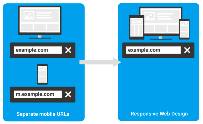
In the past, m. sites have been a way for business owners and publishers to provide their users with both a mobile and desktop experience. The desktop content is accessible via a standard domain, while the mobile-directed content is hosted on a separate subdomain with the m.domainname.com structure.
Google has warned that this might cause problems when mobile first indexing is launched in full. Sites hosted on an m. subdomain may be made accessible to users searching on desktop devices.
The advice from Google is to redirect all desktop users from their m. mobile sites to the main domain page. And, of course, make sure this main domain page is optimized for – and accessible to – mobile browsing.
m.-hosted visibility losses may not be resolved in the near future
Google’s John Mueller offered some explanation regarding this.
“With m-dot sites, it can sometimes happen that we just have the m-dot version where we didn’t actually pick up that there’s a connection to a desktop version here,” he said.
“And I don’t see us changing this in the near future or probably at all.”
In most cases, a simple redirect request should fix the problem for websites.
Publishers need to use the same meta robot tags on their mobile and desktop sites
It is important to ensure that meta robot tags are identical on both mobile and desktop sites, even if the tags are intended to provide more or less the same outcome. If tags are different, there is the potential for Google’s bots to miss the links between mobile and desktop sites, resulting in content disappearing from desktop searches even if it has been optimized for mobile viewing.
Pay particular attention to noindex and nofollow tags. If these tags are used interchangeably, without consistency, crawlers may fail to index the page in the correct way.
We have found significant disparities between the set-up of links of mobile sites and on desktop sites, with 31.39% of URLs including a different amount of internal links between the two versions. This could lead to significant problems for businesses under mobile-only indexing.
Beware of lazy loading and user interaction
Lazy loading is useful for optimizing page speed by preventing the loading of certain items until they are needed and has been a default in the Chrome browser since 2019, but this can cause problems for pages under Google’s new mobile-only indexing policies. You can still use lazy loading – in fact, it is a good idea to do so for content-heavy pages – but make sure no user interaction is required to trigger the loading of different elements.
For example, if users need to click or tap something to open the content or enter information into a form before content can be accessed, Google may simply not load this content. To avoid this, make sure:
- All content is visible to Google in the viewport.
- Pages that are set to infinite scroll are paginated so Google can direct searchers to a specific point on the page.
Mobile and desktop sites should contain equivalent content
This update is more of an underscoring of some of the above points – your mobile and desktop content needs to be the same.
Under mobile indexing, pages will be indexed according to the performance of their mobile-optimized versions. Desktop content will not be taken into account during indexing.
It is common for mobile pages to show a “condensed” or “limited” version of the “full” desktop site. In fact, we have discovered that only 16.29% of URLs offer the same word count on the mobile version as on the desktop version. Obviously, with the arrival of a completely new paradigm for Google’s indexing, this needs to change. Any content that is missing from your mobile site will not be searchable for desktop users.
Metadata also needs to be the same
Metadata is crucial to the indexing of pages within Google’s SERPs. As discussed above, the best way to ensure that Google is indexing all of your content is to ensure there is a clear and obvious link between the two pages – metadata is another area in which you need to forge this link.
Audit your metadata and make sure there is consistency across all mobile and desktop pages. Without this consistency, you may suffer a reduction in click-throughs from SERPs.
Ads can cause problems for site SEO performance
It’s important to remember that the other tenets of SEO still apply in the mobile-first environment. You still need to be targeting the right keywords in the right way, as well as providing a great experience to your users. If you have optimized your site for mobile, this will not be a problem as your images, media, and other content will appear just fine on the user’s device. But it can be a different story for ads.
Some desktop ads may appear differently on your mobile pages, taking up too much space, decelerating loading times, and just generally harming the user experience. Your page performance is measured by your Core Web Vitals; Largest Contentful Paint (LCP), which is the time taken for the largest element on your site to load, First Input Delay (FID), or the time taken for the page to become interactive, and the Cumulative Layout Shift (CLS). any shifts in the page layout when it loads.
Ads may cause an increase in the rate of CLS, which can have an impact on your conversion rate and your SEO performance. Test your ads on smartphone devices and browsers to ensure they are fully optimized for mobile.
Make sure your website is ready for mobile-only
The announcement of mobile-only indexing was a big one, and preparing your website for the shift can prove difficult. The key is consistency and to see to it that all your crucial content is available to mobile browsers. Get these crucial elements right and reap the rewards in the mobile-first landscape.


