SEO, as a job, is a fairly complex one.
Internally, we work with marketing, development, and product teams. Externally, we are working with hundreds of ranking factors that shift in weights and change based on market conditions. There are a lot of factors that make a great SEO.
You need to be technical and know what makes a good website. You need to be creative and know how to implement copywriting that converts. However, I would say that the most valuable skill an SEO can have is understanding how to communicate ideas. Learning to build stories is the number one skill available in our toolbelt, full stop.
Data-driven stories are like onions – and ogres.
Jump to a section
- I want to know why layering data is a problem
- I want to know what data to use to create data-driven narratives
- I just want to SEOgre tool
- I want to see how to read and communicate ideas about this data

It’s our job to peel back the layers to find the right elements for our story. And, sometimes, it’s a stinky job that makes your eyes tear up. But, hey, someone’s gotta do it.
In order to tell a compelling narrative, it needs to be actionable, compelling, and clear. We start with data, build context around it, and that becomes information. Once we have information, we can massage it into the story that needs to be told.
Easy, right? Well, there’s a clear breakdown between data and information. Most data is provided without context. You get a set of numbers, throw them into a graph, and then tell the client whether it moved up or down. We can do it better by layering data and here’s how.
Communicating SEO Ideas is complex
Since SEO has so many data points, we often get asked complex questions. Your boss or client may come to you and ask “How are we doing in X metric against Y competitor in Z category?”
The power of the SEO is being able to reach for the right data sources and tools to respond to this question. When we look at all the permutations of data that can be used for this research, it becomes clear what consumes large sections of an SEO’s day. Pulling multiple queries from multiple tools, and merging the information to try to tell a story.
As a perfect example of how an SEO might build a narrative, here is a tweet from Cyrus Shepard comparing Moz against competitors.
Cyrus wanted to compare the traffic of SEO tools against Google Search Central. He made 6 queries into Ahrefs, and then used a graphics program to overlay the information and label the graphs better. It was a popular tweet so it was likely worth all the effort!
In response to Cyrus, Patrick Stox tweeted making an interesting point. However, what’s more interesting here for me is that Patrick exported the data from Ahrefs and into Google Sheets, to draw 2 overlaid charts.
It becomes apparent here that overlaying data is a regular part of the job and it’s fairly time-consuming. For both Cyrus and Patrick, they relied only on one tool and one metric, but compared multiple competitors. This gets increasingly complicated as you move toward overlaying multiple tools, competitors, page types, or data types.
We continue to run into problems when numbers have different scales.
What if you want to compare PageRank against backlink count. That’s a 0-100 score against millions. You can import into a program like Google Sheets or Microsoft Excel, but you will be spending a fair amount of time editing the graph to tell your narrative.
Here’s an example of all the angles we can compare and contrast data to answer key SEO questions. You can compare permutations of domains vs domain, domains vs pages, domains vs competitors pages, and every exportable metric between those. That’s enough variability to make answering simple questions very hard! So how do we make this easier?

The Solution to Layering Data
As SEO’s, we know that there are generally 4 things that can change a website’s traffic.
- Your team changed something on the company’s website.
- Your competitors changed something on their website.
- Google changed their algorithm.
- The seasons changed and people aren’t searching for the thing anymore.
If we see shifts in rankings and positions, we need to identify when a trend changed. This has become even more important with the vast number of Google updates we’ve seen through the first half of 2021.
In order to tackle this complexity problem, we need to scale the data down so we can compare the shape of the data and provide us with relative data. We only care about finding which day a trend was broken. Then we care about finding out if it was you, your competitor, or Google who changed something. So let’s spec out how to do that.
The Tool
- Needs a date column for time series data
- Accessible by everyone
- Overlay the shape of the data instead of the raw numbers (Convert all numbers into a 0-100 range)
- Include Google updates
- Multiple timeframes
Data Sources
Here’s a starting point. Let us know what sort of data you’ve used though!
- Ahrefs
- Semrush
- Google Search Console
- Analytics
- Rank Trackers
Data Points
Each of these data points is likely tied to each other in some way. Links can inform changes in PageRank, which can change average positions, which will shift clicks, which will change conversions. Using these metrics within a timeseries chart can show where in the SEO process things broke down.
- Clicks
- Impressions
- Position
- Linking Root Domains
- Backlinks
- PageRank
- Domain Rank
- Keyword Distribution
- Estimated Traffic
- Relative Rank score (like Ahrefs Rank)
- Share of Voice
- Conversions
Introducing SEOgre – An SEO tool with layers
Introducing SEOgre – a streamlit tool where you can upload your timeseries. Here’s how to use it:
- Use any data we described in the above section, drag and drop it in.
- Hit Insert to build the chart. If you receive the error, make sure you have a Date column.
- Use the handles below the chart to change the timeframe.
- Click metrics on the legend to hide and show them.
- Hover over the bright columns to see which date a Google update happened. You can find the list of updates below the fold.
- Screenshot or save the chart.
- Refresh the page to reset it.
Let’s test it out ourselves.
Layering multiple competitors
We can recreate the chart that Cyrus created and get much more context and insight into what’s going on. Here are some possible insights.

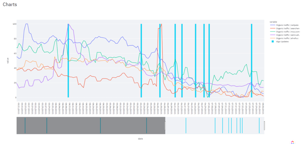
- Semrush took a big hit after the Product Review Update.
- Search Engine Land saw a crazy fluctuation during the June Core Algo update, but it quickly flattened out.
- Neil Patel just had their lowest traffic in recent history.
- Moz had a reversal after the July Core Algo Update.
Layering multiple data points
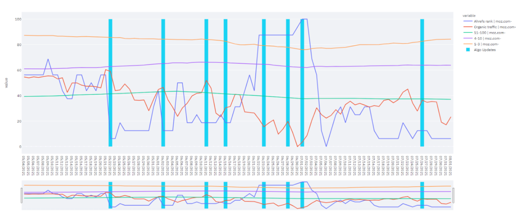
Here, I’ve included Ahrefs data for Moz.com Some insights include:
- Moz’s Ahrefs rank dropped from 100 to 0 after the July core algo update. (A lower Ahrefs rank is better.)
- Page one keyword volume reversed trend upward after the July core algo update increase.
- With a higher authority, and better keyword coverage, we saw increased estimated volume of traffic in this timeframe.
These qualitative insights can be highly insightful for an organization. Some tips on how to make these insights are coming right up in our next section.
How to communicate trends in relative charts
When we begin laying out more information, it can get difficult to read or communicate ideas about charts – especially with relative charts which no longer have absolute values.
Now that we have access to SEOgre, here’s a primer on how to read and use the charts. I’ll be using the same sites Cyrus used in the original example.
Reading a chart might seem like a dead-simple skill, however, it is a lost art called Technical Analysis. Financial advisors have spent years practicing the art of reading charts and running analyses on the data to predict trends and results.
Let’s review some of these skills as they are essential to building a narrative from data.
Channels
A channel is two lines along the peaks (max points) and the valleys (min points).
Drawing channels is possible by drawing these lines along pivot points on the underside of the chart and pivot points on the top side. Timeseries data like this always tend to bounce between an upper and lower bound.

Here, I’ve drawn channels from the same chart, and we can see that Moz’s traffic had a period of growth, regression, then a small range of growth and regression. It’s common for these patterns to repeat themselves, as smaller echoes of history. However, I would not imply that there is a fact to these. All channels do is clarify patterns over time.
Breakouts and Reversal
Trends and channels are ended by a breakout or a reversal. We can identify that Moz broke their trend following January 2020, and have a reversal followed by a period of consolidation.

This is where layering data really comes into play. We may want to know what happened in that time frame that helped Moz breakout. Additionally being able to zoom in helps us find the exact day they broke out.
Resistance
Generally, data has an upper ceiling that it keeps bumping into. This isn’t because of the data itself. It’s just a weird thing about human psychology. Often it is an arbitrarily round number that seems scary, like a million.

Moz has that exact Resistance line going on here, as they fall every time they bump into a million. Breaking through that resistance line would be a good goal for their team to monitor as they may be surprised to find new growth and horizons lay beyond that line.
All of this may not seem very scientific, and IT ISN’T! However, as a pseudo-science, it helps us frame seemingly arbitrary events with context, arming us with information to create a narrative.
Multiple Timeframes
Explore your data by zooming in and out of different time frames. Each section may tell a different story or provide different shapes and contexts.

While the data might not change, the portion of data you choose to present can entirely adjust the narrative. This one-year chart is entirely less actionable than the all-time chart we’ve previously been looking at.
Making Happy Clients or Bosses
People are looking for answers from reporting. We can provide better answers through layering our data and improving context. Additionally, overlaying multiple data sources can improve exploration and discovery.
Clients are happy when the data is clearly laid out in front of them, so they can come to the same conclusions you did, and they can take that chart away and show anyone else, helping them come to the same exact conclusions. That is how we get systematic progress through a company and how we build internal champions to build SEO. This can be even more critical for enterprise SEO.
Let’s get back to our original example. Your boss or client may come to you and ask “How are we doing in X metric against Y competitor in Z category?” At this point, I hope we’re all far more confident that we can explore that question, find the answer, and get on with our day.
Whether the data tells a good or bad story, make sure it always has a story to tell.