As 2020 wound down, and I awaited the delivery of my Search Marketer of the Year award, I was honored to join the amazing Aleyda Solis and fantastic Jamie Indigo in contributing to the SEO chapter of the Web Almanac. I encourage you to check it out because we uncovered a lot of interesting things about the web by quantitatively reviewing millions of homepages.
The most compelling insight that I got from our analysis was how often there is a material difference in content served between the desktop and mobile user context. Directly from the analysis, we found a disparity between the median number of internal links being shown across the Desktop and Mobile pages.
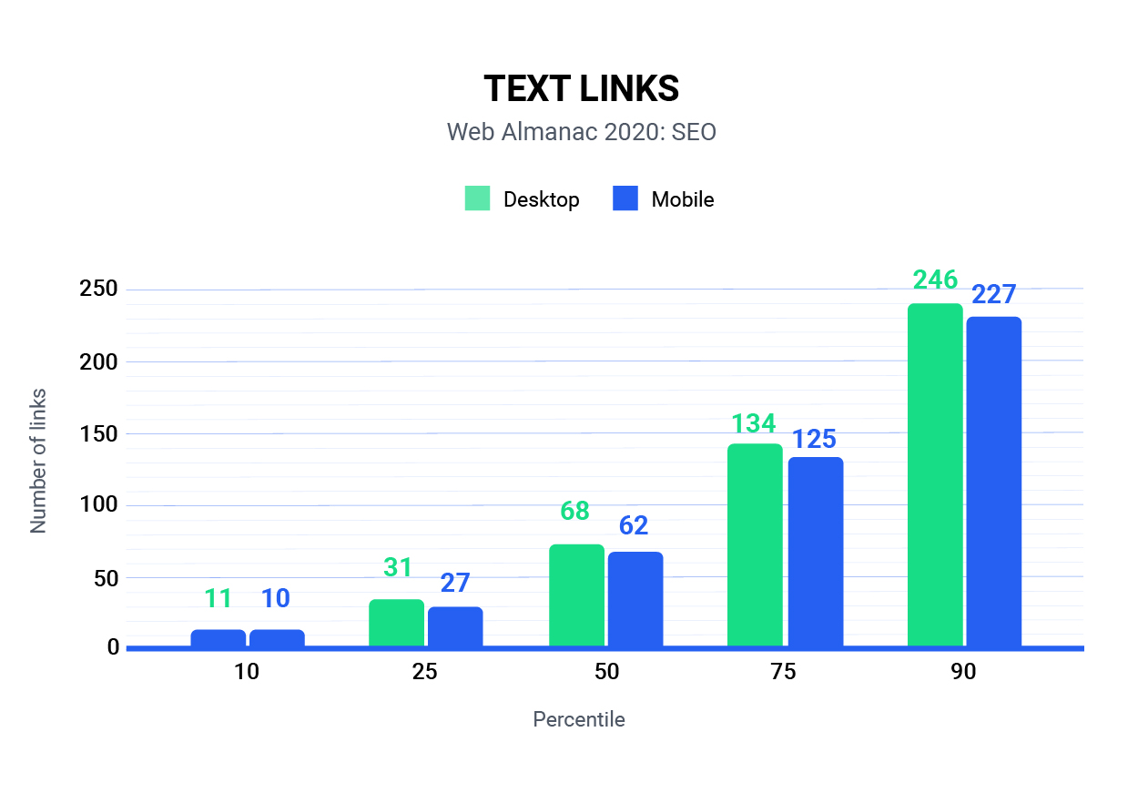
From the above snapshot of the analysis, every percentile of homepages that we analyzed had fewer internal links shown for mobile than they did on the desktop experience. In preparation for this post, I asked Tony McCreath, the Australian technical SEO (and hairdresser to the stars) that acted as our data analyst to pull a specific subset of the data where we had both the mobile and desktop page for direct comparison. What we found was somewhat alarming.
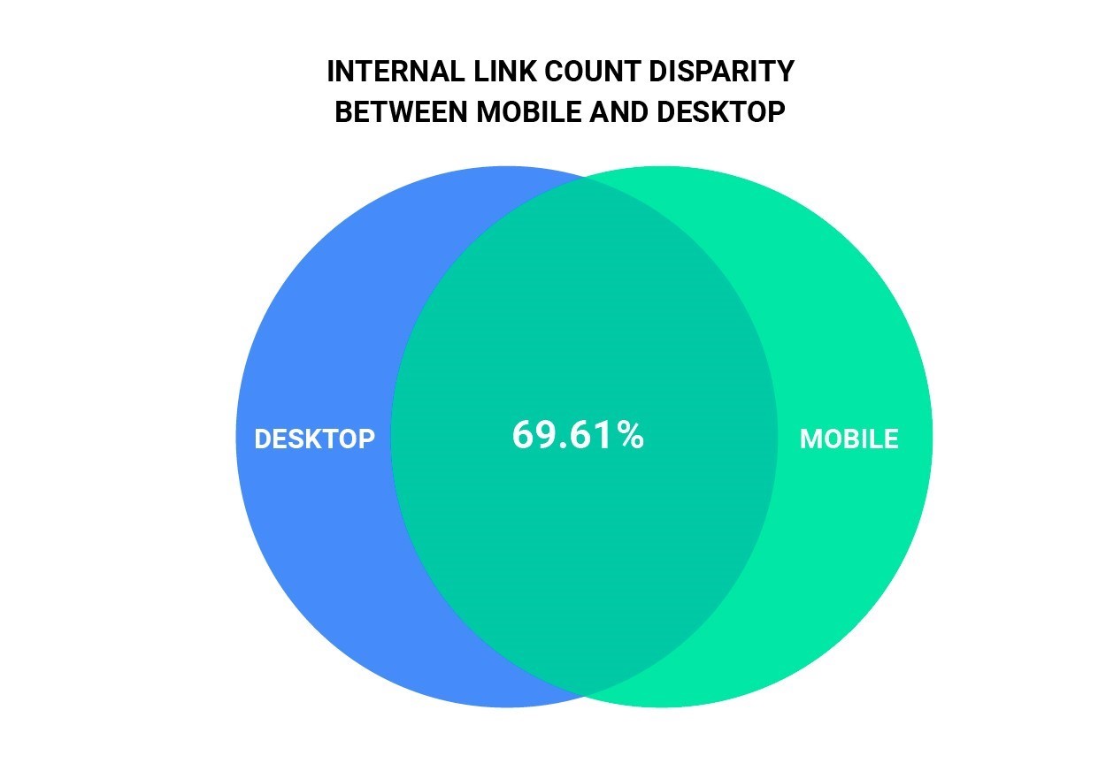
In our dataset of 5.3 million URLs, we discovered that 30.31% of URLs served a different number of internal links for desktop devices than they did for mobile devices.
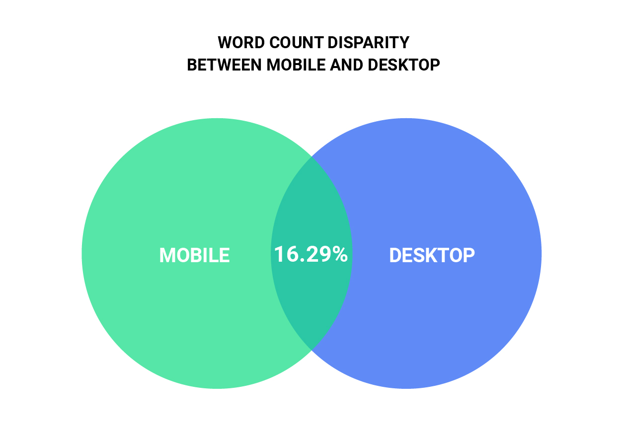
Scarier still, we found that only 16.29% of pages served the same word count between Mobile and Desktop. For the technical minded, the Word Count we considered is based on what is extractable from a rendered page using document.body.innerText.
We also took a look at indexability and found that 2.98% of URLs that self-canonical on Desktop do not do so on Mobile. There’s also a subset of 0.51% of URLs where the opposite is true.
Keep in mind that our analysis only looks at homepages. So if we were to take the time to extrapolate this out, I believe that we are looking at a major issue across the web.
Why Is this a Problem?
Google made an official shift to Mobile-First Indexing as of September of 2020. Despite that, many of the sites I work on continue to show inconsistent distributions of verified mobile and desktop bot crawl activity. Here are a couple of examples:
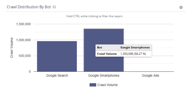
For a large and popular e-commerce site, they are seeing 58.27% of their crawl coming from Googlebot Mobile.
We also have a large site that is one part publisher and one part marketplace that was switched to MFI as of November 2018.

However, despite that indication in Google Search Console, their crawl activity still stands at 75% verified bots remaining Desktop-first.
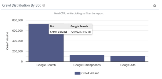
So, what’s the deal Google? Are we doing mobile-first indexing or naw? If we are, why is so much desktop crawling still happening? Or, is it that you’re still crawling with desktop for URL identification because you know there are more links on desktop, but you’re still using mobile rendering for the indexing process? Somebody get Paul Hahr on the line!
An Issue is Brewing
Here’s the thing, mobile-first indexing is not without its own set of problems. For a site that we recently worked with, their bot activity is nearly split down the middle. As a result, Google is continually going back and forth between which version of any given page they want to index.
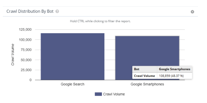
Their desktop versions are incredibly robust and, as you may imagine, their mobile versions are quite pared down. The difference in word count ranges from a hundred to over eleven thousand words. Similar things can be said about the internal link counts.
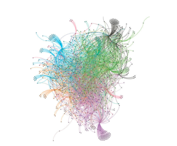
In cases like this, Google has a Frankenstein representation of a website in their index with an incongruent link graph and subsets of the content being featured. In simpler terms, you may be presenting a link graph that looks like this on desktop:
But due to the inconsistencies in crawling and indexing, Google may index a link graph that looks like this for your site:
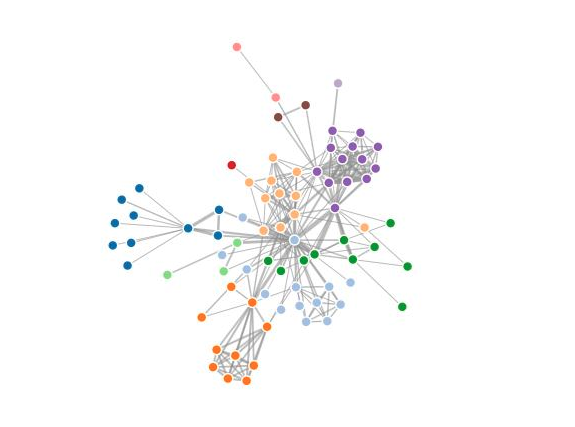
Now apply the same idea to body copy on those pages. While it may be obvious, it’s worth stating that any given page’s relevance will inherently change by having a different set of words on it.
Google representatives have indicated in recent discussions that indexing will become mobile-only as of March 2021. In other words, all those sites that are rendering less content on mobile are about to have a bad time.
While much of the SEO ecosystem is preparing for the Core Web Vitals component of the upcoming Page Experience update, I find myself needing to sound the alarm about the content parity problem.
This is the real Mobilegeddon.
SEO’s Context Problem
Here’s what we know. Crawling and rendering are two separate processes. For Organic Search, this means there are four distinct contexts that Google may currently consider for any given web page.
- Desktop HTML – The raw HTML version of how a page is delivered from the server to a browser
- Desktop JavaScript – The fully rendered version of a webpage as it is seen in the browser up until the Document Ready state
- Mobile HTML – The raw HTML version of how a page is delivered from the server to a mobile device
- Mobile JavaScript – The fully rendered version of a webpage as it is seen in the mobile browser up until the Document Ready state.
Naturally, Google experiences those user contexts with a Googlebot user agent. For the purposes of SEO, that means a non-Googlebot version of that context is an additional version of each of those four contexts to consider.
While you may not see this often in the wild, any given webpage can be configured to react differently in all eight contexts. As a result, there may be cases where elements of the content and/or code are changed in material ways depending on the displayed context. In fact, depending on how a site may react to different browsers or phone makes and models, we could be talking about many more contexts. I’m limiting it to the 8 to keep this discussion and the action items manageable.
Specifically, what we need to consider are the differences in:
- Body copy
- Code structure
- Internal links
- HTTP headers
- Meta Robots directives
- Canonical tags
Some people might recommend reviewing the differences in metadata as well. You are certainly welcome to do so. The other items are likely to have a much larger impact, so I prioritize them over metadata.
SEO’s context problem is that there is no tool that surfaces this data for you out of the box. As I understand it, SiteBulb has raw vs rendered comparison features between HTML and JS versions of pages, but I’m not aware of other tools that natively do this.
Why?
For the same reason that many tools did not do JavaScript crawling at all until recently. It’s computationally expensive to crawl a URL up to 8 times, store all the HTML, and parse its features. The cost of crawling would increase exponentially for analysis that often may yield no additional insights.
However, many people across the web may not understand the magnitude of this problem due to the fact that their diagnostic tools are not natively considering it.
How to Diagnose Content Parity Issues
Uncovering content parity issues mirrors the approach you might take to determine whether or not you have issues with JavaScript SEO. Effectively, you’re trying to figure out what it is that a given webpage is showing to a user that a search engine crawler cannot see because the page may only be showing it in a context that differs from what search engine crawls or indexes with.
As Google makes its move to mobile-only indexing, they are effectively whittling down the number of contexts that they consider. This actually makes the job of diagnosis a little bit easier.
While there are 8 user contexts to consider, you should start with comparisons between what is served to Googlebot Desktop vs. Googlebot Mobile. I will walk you through that step by step and you can extrapolate from there to fill out the remaining user contexts.
First, here’s an Excel template that you can use with the legendary Screaming Frog SEO Spider. Even if you don’t have a Screaming Frog license, the 500 URLs that the free license affords should be enough to determine if there is a problem.
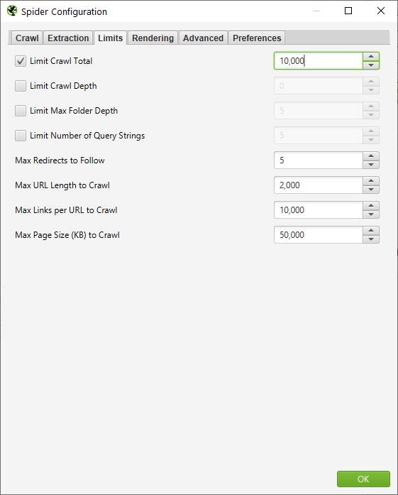
1.Configure Screaming Frog to crawl using the Googlebot Mobile user agent without JavaScript rendering

2. Crawl a representative sample of pages. I generally do 10,000 for the sites I work on.
3. Complete your crawl
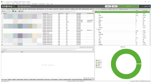
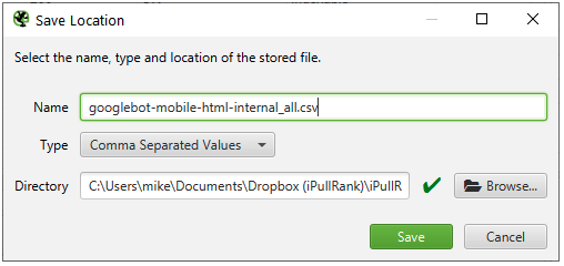
4. Export the Internal tab
5. Configure Screaming Frog to crawl in list mode using the Googlebot Desktop user agent without JavaScript rendering

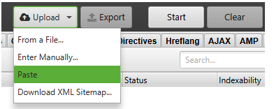
6. Switch to List Mode and Paste the list of URLs from the first crawl
7. Complete your crawl
8. Export the Internal tab
9. Open the Crawl Comparison Spreadsheet
10. Copy the contents of the Googlebot Mobile export to the Googlebot-Mobile-HTML tab
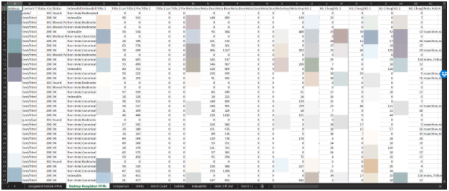
11. Copy the contents of the Googlebot Desktop export to the Googlebot-Desktop-HTML tab
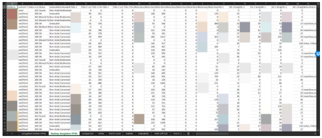
12. Copy the URLs into the Comparison sheet. It should populate the Pivot Charts
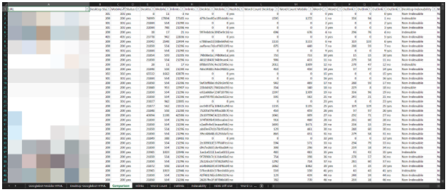
13. Review the Pivot Charts for comparison
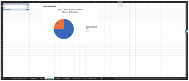
There is value in comparing the contexts in a variety of combinations to uncover disparities. The primary contexts to compare against are Googlebot Mobile HTML and JS because they will soon be all that Google is using to ingest the web.
You can repeat steps 5 through 8 and add them to the additional tabs in Excel and generate additional comparisons. For ease, here are the user agents that I use for the contexts above:
- Googlebot Desktop HTML & JavaScript – Mozilla/5.0 AppleWebKit/537.36 (KHTML, like Gecko; compatible; Googlebot/2.1; +http://www.google.com/bot.html) Chrome/88.0.4324.150 Safari/537.36
- Googlebot Mobile HTML & JS – Mozilla/5.0 (Linux; Android 6.0.1; Nexus 5X Build/MMB29P) AppleWebKit/537.36 (KHTML, like Gecko) Chrome/88.0.4324.150 Safari/537.36 (compatible; Googlebot/2.1; +http://www.google.com/bot.html)
- Desktop HTML – Mozilla/5.0 (Windows NT 10.0; Win64; x64) AppleWebKit/537.36 (KHTML, like Gecko) Chrome/88.0.4324.150 Safari/537.36
- Mobile HTML & JS – Mozilla/5.0 (iPhone; CPU iPhone OS 12_2 like Mac OS X) AppleWebKit/605.1.15 (KHTML, like Gecko) Mobile/15E148
Check the documentation to see the latest on what Google has indicated is in use.
Meet Parito
Here’s the thing, you shouldn’t have to do the process that I just walked you through. It is tedious and does not lend itself to scale because you will have difficulty crawling in parallel from your local machine. It also does not allow you to get a sense of where the disparities are exactly in the code. This can also be a challenge at scale for enterprise SEO. So, I’d like to introduce you to a new free tool that I whipped up called Parito.
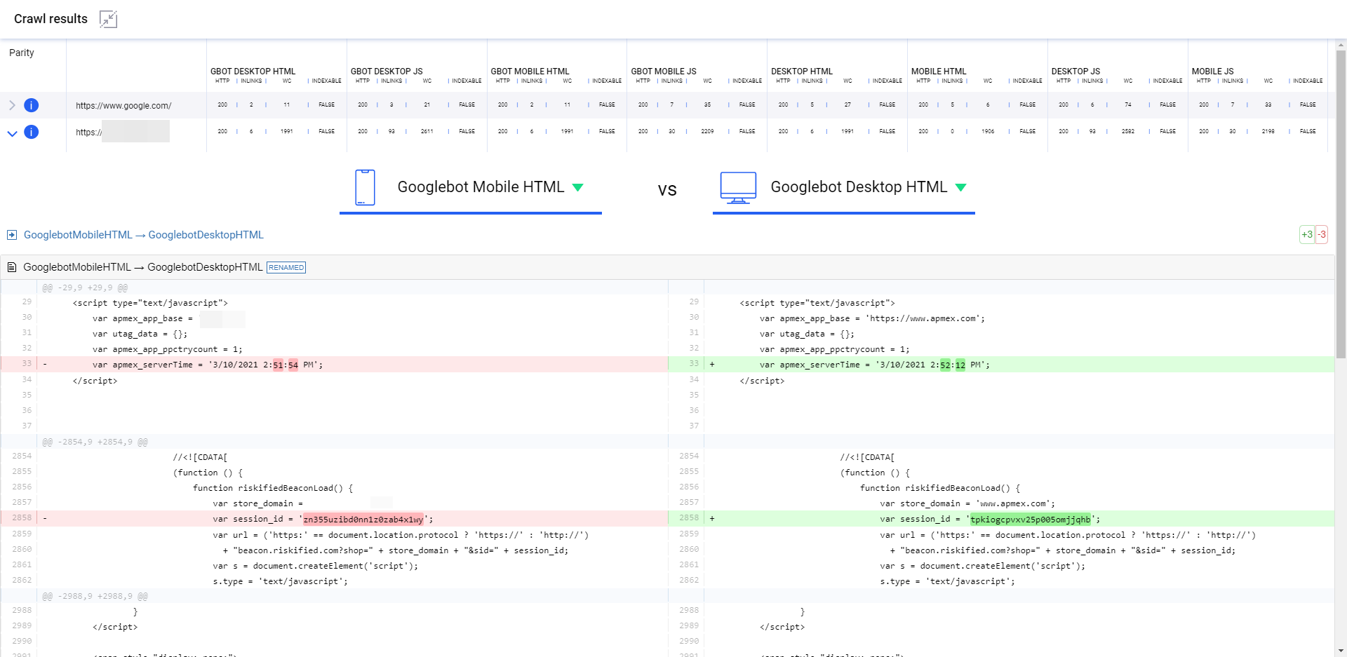
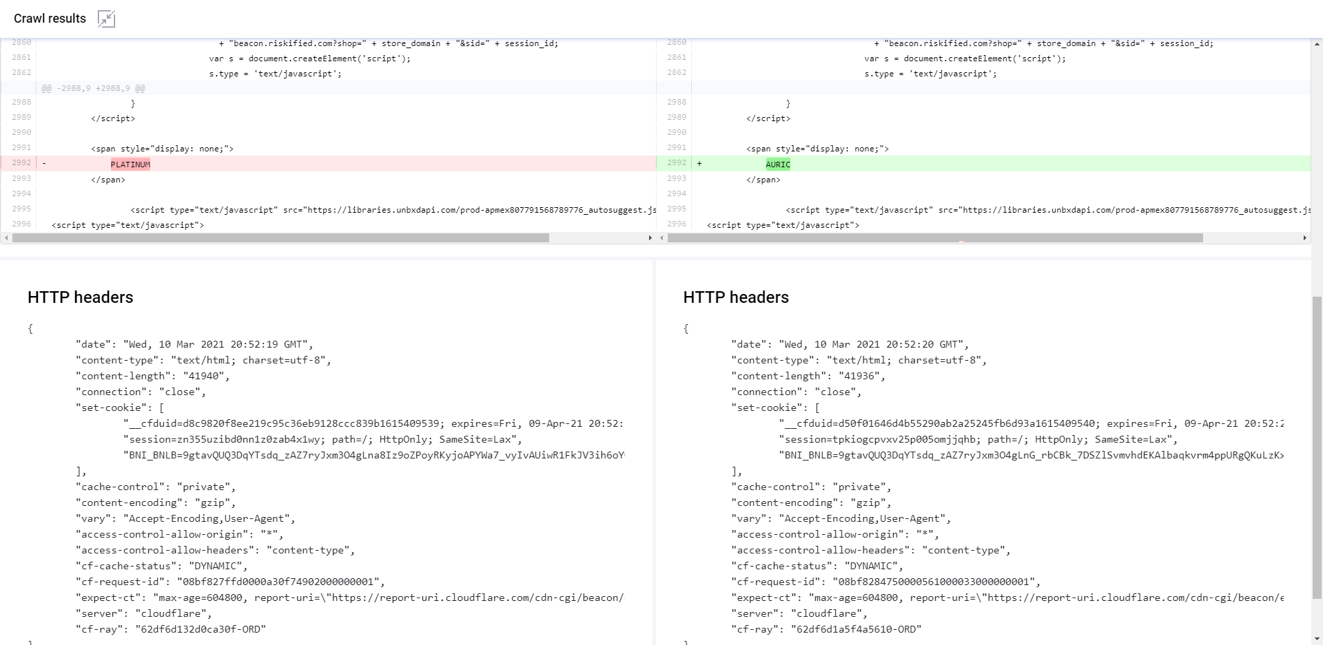
Parito crawls every URL 8 times, extracts features, and compares them against the features of the code returned to Googlebot Mobile-HTML. When you click into any URL that it has crawled, it will give you the diff and HTTP headers between the two contexts that you’ve chosen from the dropdown.
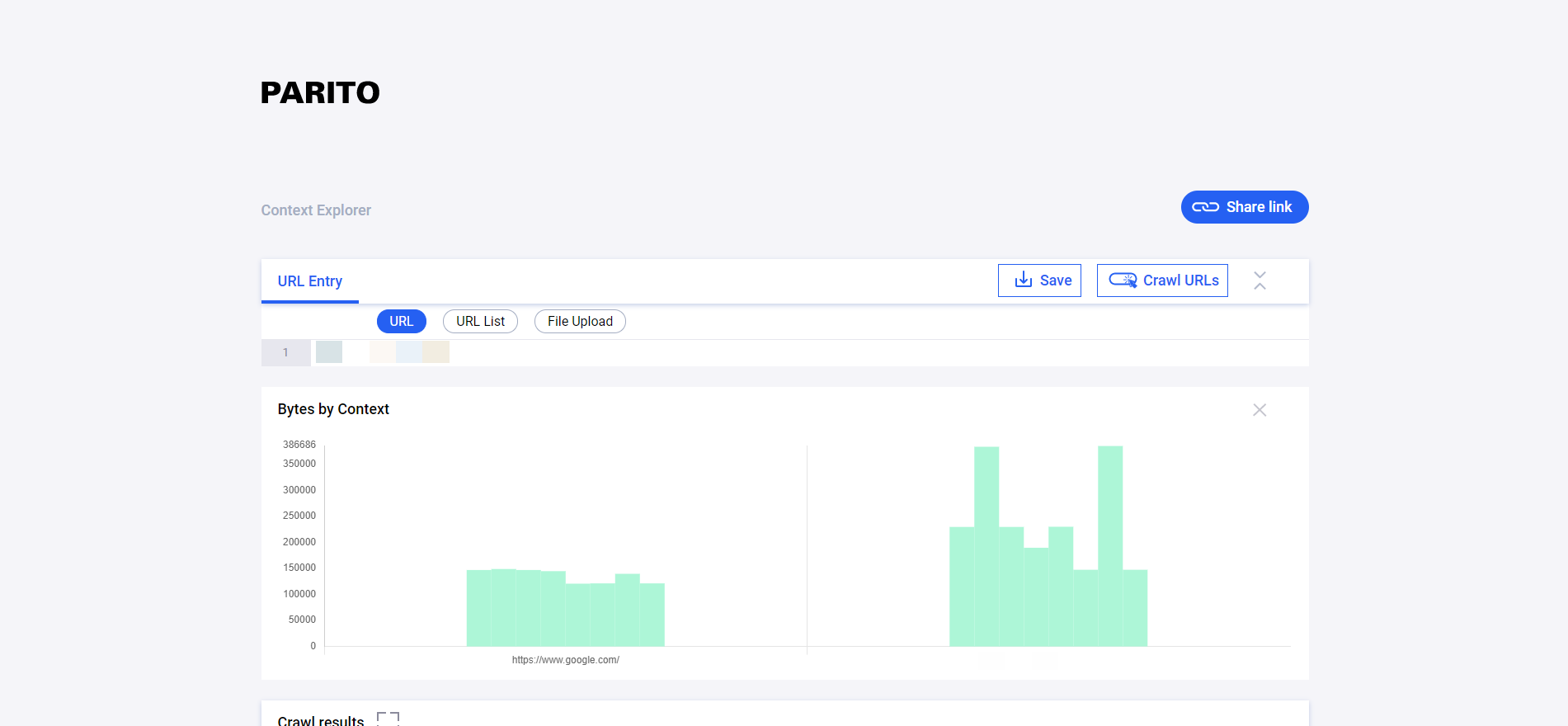
The tool also visualizes the differences between contexts by showing the number of bytes per context above.
It’s just a little something I whipped up. Feel free to comment if you run into any bugs or have feature requests. Also, shout out to our SEO Engineer, Colt Sliva, for helping me through some issues during the build.
Let Your Website be a Parity of Itself
As always, I bring this issue up in hopes that the SEO tools providers and/or the Google Search Console team consider adding tooling like this to their respective roadmaps. Site owners and SEOs sorely need scalable ways to uncover these issues.
I also think that it has been a mistake for Google to push to abandon the progressive enhancement narrative for dynamic serving. Progressive enhancement aligns better with the mobile-first ethos and would help us align around the idea of making content available to the lowest common denominator of devices. It would simultaneously solve all JavaScript and mobile context problems that we all navigate.
But, hey, this way certainly keeps me employed.
Now over to you, what types of context parity issues have you seen in the wild?
**UPDATE ONE** Likely due to the parity issues that I’ve discussed herein, Google has pushed back the mobile-only indexing timing a couple of months. John Mueller indicates that it could be April or May that it is rolled out.
**UPDATE TWO** Screaming Frog recently released version 15 of the software and it features native crawl comparison functionality. It allows the user to compare two crawls of any configuration that you decide.
**UPDATE THREE** November 26th 2021: Despite the focus on CWV and Page Experience updates, the mobile-only index has taken a back seat. According to a Google Search Central post from John Mueller:
“We thought that we could complete the move to mobile-first indexing by March 2021. However, we found that some sites were facing unexpectedly difficult challenges and we wanted to accommodate their timelines. We currently don’t have a specific final date for the move to mobile-first indexing and want to be thoughtful about the remaining bigger steps in that direction.”
Additionally, he provides this guidance:
“If your website has different mobile and desktop versions, you may see changes when we shift your site over to mobile-first indexing. If your website has the same content on mobile and desktop, you generally won’t see changes in how your site is shown in Search. In general, this is a technical change with regards to how Google crawls and indexes the content on a website. If your website is not in mobile-first indexing, and you have resolved any issues that your site has, you don’t need to take further action. Over time, as we continue to see sites become ready for mobile-first indexing, we’ll start shifting these over again.”
So there you have it. You still need to ensure content parity, but the official deadline for the mobile-first index has been delayed.

