Every year, more internet searches happen on mobile. But, a lot of websites are designed for desktops first, which means mobile searchers aren’t always accessing the best possible user experience.
The solution? Mobile-first design.
What Is Mobile-First Design?
Mobile-first design involves looking at what your mobile user needs first and then designing from that standpoint. It puts the user at the center of the design process.
- What content do they need to see?
- What action do you want them to take when they land on a specific web page?
- How can you prioritize and arrange web page elements, such as the navigation bar, product images, your blog, and call-to-action buttons, so the most important ones are prominent?
Because mobile screens are smaller than desktop screens, you have a lot less space to work with. This forces designers to focus on essential content. What really matters? What are users visiting your site for?
By honing in on the critical elements, you can create a seamless, easy-to-use, easy-to-navigate, uncluttered design that mobile internet searchers can dive right into.
Why Mobile-First Design Matters
So, why should you take a mobile-first approach to website design?
Internet users appreciate mobile-first design because they’re using mobile devices to search the internet more than ever.
- There are now 5.22 billion unique mobile phone users in the world – that’s roughly 66 percent of the global population.
- 92 percent of internet searchers use mobile devices to go online at least some of the time.
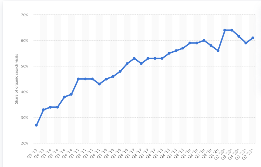
- In the last year, over 60 percent of all organic searches made in the US were on mobile.
And, search engines like it because it helps them provide what internet users want – which in 2021, is a user-friendly, mobile-friendly website. Eighty-five percent of adults believe a company’s website should be as good or better on mobile.
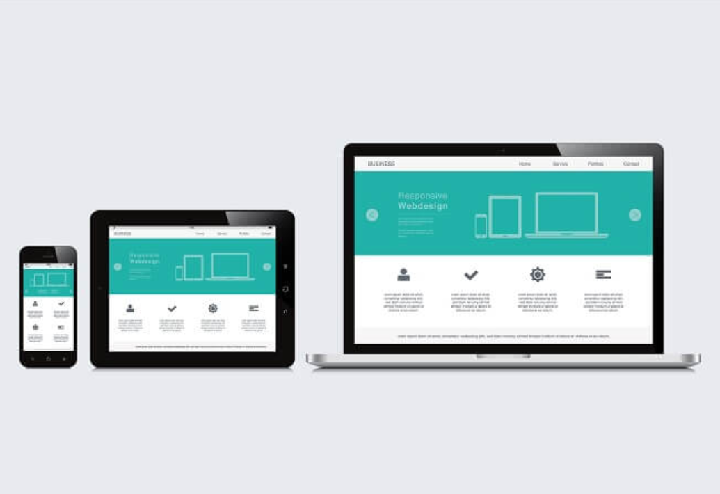
Is Mobile-First the Same Thing as Mobile-Responsive Design?
Mobile-first and mobile-responsive sites have a lot in common. They both make your website accessible on different devices. They are both better for SEO than having a desktop site and a separate mobile URL, something Google has said causes issues for search engines and users.
The difference lies in the design strategy.
- Mobile-first – Mobile-first is another way of saying desktop-last. Designers make design decisions for the smallest device size first. Then, they move up to the largest screen size, and generally the more advanced design, incrementally. This strategy is known as progressive enhancement.
- Mobile-responsive – Designers use the desktop user experience to make initial design decisions. Then, they take the desktop design framework and shrink, move around, or refactor the different components to fit within smaller device sizes. Mobile-responsive sites may look and function well on smartphones and tablets, but the original intent of the design is not to fulfill the needs of mobile users.
Why Is Mobile-First Better for UX?
Mobile-first design is also user-first design. To make it work within such a limited space and with innate restrictions, designers have to identify precisely what a user would like to see within the context of the search environment. This leads to a better experience for mobile users – and a more impactful web presence for your business.
This isn’t just a theory. It’s the power of purpose-built UX in action. Fifty-seven percent of users say they won’t recommend a business that has a poorly designed mobile site.
The problem with a desktop-first design approach is designers will focus on making the best possible desktop version. To do this, they’ll use features that won’t work well on mobile, such as the hover effect – something that’s not even possible on mobile browsers.
They’ll also look at the overall aesthetic and navigational flow on a larger screen, which, when adapted to tablet and smartphone screens, might look ok but falls short when it comes to usability. The interface may not be intuitive, or the most important elements aren’t easy to find.
Mobile-first forces designers to start lean. Then, they use advanced features and additional content elements later on when they can add value to the user experience.
What Does Google Have to Say About Mobile-First?
Google officially switched to mobile-first indexing in September of 2020, which means most of the crawling that’s done for search is performed by their mobile smartphone user agents. Until things change, Google will only crawl your domain with the traditional desktop Googlebot once in a while.
One of Google’s objectives is for “crawling and indexing to match how users interact with the web.” Now that the majority of searchers are started from a smartphone or other mobile device, Google is taking a mobile-first approach to ranking. So, if you want to boost visibility, your website should be mobile-first as well.
How to Create a Mobile-First UX
Think of mobile-first design like this: if you were moving from a five-bedroom country home to a one-bedroom condo downtown, you wouldn’t stuff all of the furniture that you had in the house into the condo, would you? That’s because all the ‘stuff’ that has value in the larger space isn’t as useful in the small space. And, it would be a mess.
Also, your sleek condo is going to offer the best functionality and aesthetic feel if you stick to a minimalistic, highly practical design – a simple color palette, well-organized, and unobtrusive storage space.
Keep only the essential, make everything you need accessible, and ensure there’s enough space to move around. That’s how you should approach mobile-first design if you want to give users the best possible experience.
Here are some mobile-first design tips you can use:
- Create a visual hierarchy, so you display the most important elements prominently.
- Avoid large complex graphics and landscape photos, which don’t display well on small screens.
- Use a font that’s easy to read, such as Roboto, Helvetica, and Open Sans.
- Place your most important CTA button above the fold and make it large enough for a finger tap.
If your site doesn’t have a mobile-first design, we can help. We’ll put your mobile users first, so your site is primed to deliver results. Get in touch today to get started.


