Have you ever been on a webpage you couldn’t wait to get off of, no matter the quality of its information? Clunky navigation, no logical organization, slow speed?
How about that funky thing where you click on a button, and then it jumps away?
Chances are, you didn’t want to visit that page again, and neither would anyone else.
Even though page speed and some of the other factors have been algorithmic actors for a while, Google has finally realized the importance of a seamless overall page experience for SEO.
All I can say is, it’s about time.
Almost a year ago, our own Mike King got together with some other SEO pros on Search Engine Land for an in-depth chat about how Google’s Page Experience update will impact user experience. It’s worth a listen if you have a spare hour.
Here’s the short version: In my book, a search engine shouldn’t direct its users to a page that wastes their time. It’s every bit of a time-suck as landing on a page stuffed with keywords and little relevance.
In the time it takes you to find what you need on such a page (if you could find it at all), you could have searched through three other sites that provide users with a seamless experience. There are already hundreds of factors that influence the ranking of your website pages. Google’s Page Experience criteria will soon also contribute to your page’s ranking.
What Is Google Page Experience?
Google explains Page Experience as “a set of signals that measure how users perceive the experience of interacting with a web page beyond its pure information value.” These signals include Core Web Vitals, which measure user experience by the numbers: loading performance (including speed), visual stability, and interactivity.
Google Page Experience also includes safe browsing standards, mobile-friendliness, interstitial guidelines to discourage intrusive popups and banners, and whether or not a site has a secure protocol (the “https” prefix before a URL), which ensures that data transferred over the connection is authenticated and secure.
Although Page Experience will take on more importance in determining where you land in search results, it won’t eclipse having the best content. But it’s definitely the tie-breaker.
So, your goal should be to have both a stellar user experience and superb content.
Google Update for Page Experience: The Timeline
Google’s first update that will include Page Experience will roll out soon – in the middle of June 2021. According to Google, it should be complete sometime toward the end of August.
It’s crunch time, people.
How to Audit Your Website for Page Experience Google Ranking Factors
To prepare your site, there are some quick checks you can do to make sure you’re at the head of the pack over the next few weeks as the mid-June updates roll out. These Google ranking factors will determine your place in the search queue, so let’s get started.
Measure loading time
A metric called “largest contentful paint” (LCP) is just a techie word for measuring how long it takes the largest element on your page to load. Simply load a page, identify the biggest element, and then re-load the page.
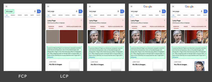
Google rates sites that load the largest element within 2.5 seconds as having a “good user experience.” If your page’s largest element loads slower, you’ll need to tweak it until it reaches the 2.5-second mark.
Think it doesn’t matter? Think again. Even a delay of 1/10 of a second in your load time can cause customer activity to drop by one percent.
Check your first input delay (FID) time

First input delay is the wait time between clicking on a button or link and the browser’s response time. For a seamless user experience, that time should be less than 100 milliseconds, says Google – perfect for even the most impatient among us.
Identify and improve cumulative layout shift (CLS)
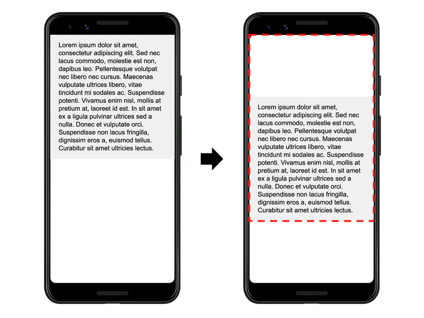
If you’ve ever seen page elements shift while a page is downloading, it can be annoying. You’re all ready to click on that contact form on the top right-hand sidebar to get your ebook, and all of a sudden, it wanders away.
That’s Cumulative Shift, and here’s how you measure it. It gets a little geeky from here, so you’ve been warned.
The first part is the impact fraction. That’s the space your shifty little element takes up on your mobile screen. The second part is the distance fraction, the amount of space the element moved from its original position.
Then, multiply the impact fraction by the distance fraction, and you’ll have the cumulative layout shift number for that page. If it’s more than 0.1, you’ll need to tweak it to come up to Google’s standards.
Test for mobile-friendliness
This one’s easy. Just use Google’s handy Mobile-Friendly Test and see how you measure up. It’s a simple yes or no answer – and it only takes a second or two. If your page isn’t optimized for mobile, it’s time to get with your SEO team for a tune-up.
Ensure that your visitors will enjoy safe browsing
Check to see that your site contains no malicious or deceptive content: We know; you wouldn’t think of such a thing. However, there are plenty of bad guys out there who might fiddle with your site, infesting it with malware or other issues.
Google has a fairly straightforward test to check. Simply enter the page’s domain and fill out the form. You’ll need to verify your domain ownership by signing into your domain name provider, copying a code Google provides into your page’s DNS configuration, and then pressing ‘Verify.” Google warns users that the process might take at least a day’s time to complete – so start early.
It’s a great way to check safe browsing over time, but if you want to find out right now, use this quick-check tool. It takes only a few seconds, and there’s no form to fill out. Just submit your URL, and you’re done.
Check to see that your site is secure


If your site’s URL doesn’t have an “https://” prefix, you’ll need to secure or re-secure it to ensure a safe browsing experience for your audience. Although the process is fairly straightforward, it will take some time, so don’t wait until the last minute to secure it.
Eliminate intrusive interstitials
You know that moment when you’ve clicked on an article, begun reading it, and then…a popup appears. If you’re like me, a swear word or two crosses your lips.
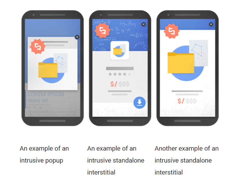
I mean, you’re plugged into the content, waiting to see what comes next, and then, a message pops up, saying, “Do you want to sign up to our email list?” or “Click here to get your FREE ebook on (the topic you’ve just been reading about).” You think, “Not if the rest of your stuff is as annoying as your blog’s user experience.” You just want to swat it away, like a fly.
But then, take a look at your own website. Has some junior staffer dragged some stats out that convinced you to drive conversions with a popup form or two because they watched a Neil Patel video from four years ago?
Chances are, your audience will feel much the same as you do. Instead, include the form at the END of the blog post so that your audience can enjoy the read in peace. If your content is a must-read for its quality and relevance, chances are better they’ll become regular subscribers without your cute little popup.
Yup, even pro-popup Neil has moved a bit since then. Go to one of his blog posts if you don’t believe me. No popups to ruin your experience.
How to Understand Page Experience for SEO from Your Audience’s Perspective
I know. It’s all about conversions, ultimately. But something’s happened to Americans over the last five years or so.
They’re so done with the loud and showy. Like Vroom’s viral ad poking fun at car dealers points out so well, people don’t come to your site for the bells and whistles. They come for information that can help them.
A superb Page Experience can guide them through their buyer’s journey by putting them in control.
Delight your audience – and Google – with a page experience that will build trust, not wreck it.
So, if you want your content optimized for 2021 audiences, take your SEO game to the next level by giving them a stellar experience each time they visit. And, if you need some help getting it done, the iPullRank team wrote the book on great experiences. So, get in touch with us today!
- The Ultimate List of Every Google Update Related to Mobile First - September 1, 2021
- 5 Examples of eCommerce Content Marketing - August 25, 2021
- How To Create a Black Friday Content Strategy - August 19, 2021





Leave a Comment