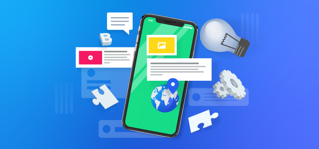
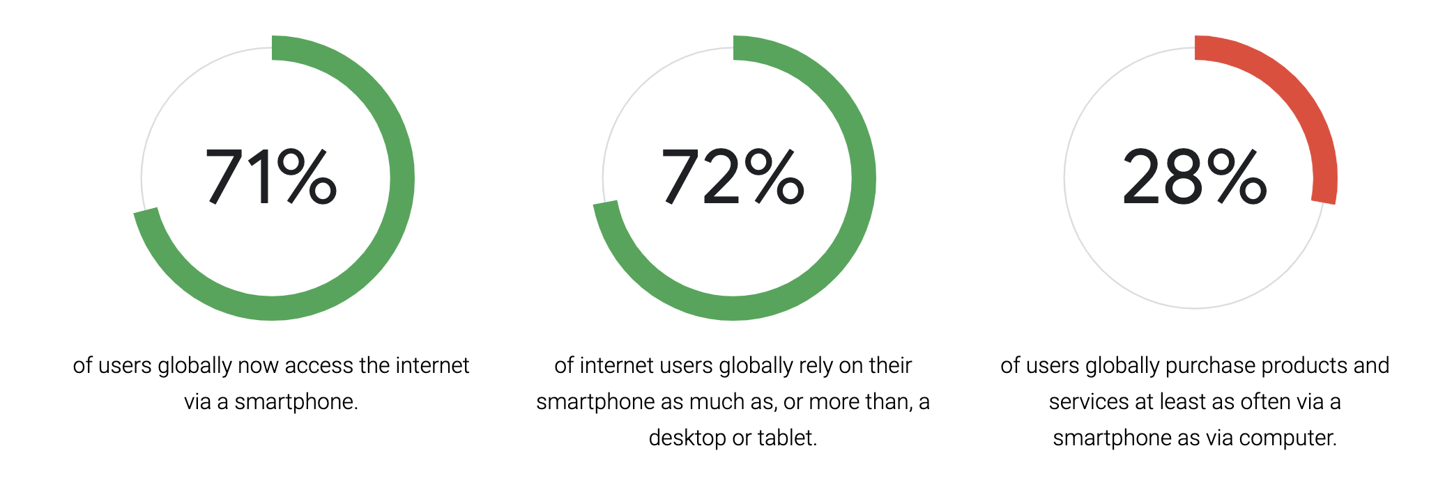
Mobile usage has swept the world. Nearly 95% of Americans own a cellphone, 77% of them a smartphone. 1-in-5 Americans are “smartphone only internet users”, meaning their smartphones provide the primary online access. With so many people depending on mobile, the experience of your mobile site has to not only cater to the environment but to users’ needs as well.
Last month, Google released a guide called Masterful Mobile Web, where they assessed over 1,000 of the most visited sites and their mobile experiences. Showing how the top brands create smooth and seamless mobile experiences, Google is giving brands and marketers a view into which sites they deem mobile-worthy and how brands might implement similar tactics.
So, What Makes a Masterful Mobile Experience?
Exploring sectors including Retail, Travel, and Finance, Google’s Master Mobile study assessed sites based on the following usability areas:
- Findability: Following a search, are users taken to the most appropriate page? Does the on-site search help them quickly find the right product or service?
- Product Pages: Are the main product or service images and details presented clearly and consistently? Are there prominent next steps or calls to action?
- Registration & Conversion: Are forms easy to complete? Are price breakdowns provided? Is the transaction process simple and safe for users?
- Mobile Design: Are the site’s pages mobile-friendly? Are they well laid out, with clear headings, well-labelled icons, and relevant content? Is branding consistent?
- Speed: Is the site’s performance optimized for mobile? Do pages load fast enough to not disrupt the overall experience?
While many of these features are not exclusive to mobile, Google is elevating them to declare that to create an optimal mobile experience, a brand must consider these things. User experience is at the heart of each of these tenets and each brand must KNOW their user base to understand how to serve them.
Once you know your customer and what they’re looking for, you can provide them the best mobile experience to help them find those things. The best parts of crafting an optimal user experience are:
- There is no one way to deliver a great experience. It depends on your users, your product, and your brand identity.
- There are tons of tools, services, and methods to help quantify that experience and incrementally improve it.
Let’s dig deeper into the study and look at each of Google’s experience areas and the solutions for each.
While this is by no means a recommendation to implement all of these solutions, it is a list, straight from the source, of the available solutions to improve your mobile site experience.
Download the 75 Mobile UX Best Practices Checklist
Need expert help with optimizing your Mobile User Experience and improving your buyers’ journey? Contact Us!
75 Ways to Optimize your Mobile Experience
Here are 75 solutions to improve your mobile site experience, straight from Google.
FINDABILITY
- Key Actions: Are your key actions are visible on the homepage? Eg. apply now.
- Deep Linking: From search engine results, users are deep-linked to the most relevant page, and not just sent to the homepage.
- Visible Search: On-site search field is above the fold on all pages. If it’s behind a search icon it expands without a new page load.
- Scan Results: Search results and listing pages are easy to scan for specific info, or skimmable for a more general overview.
- Relevant Results: The listing or search results pages only contain relevant results.
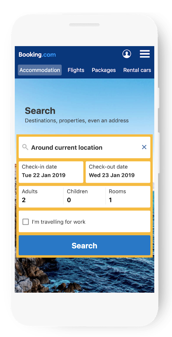
- Filtering: Filtering is both available and prominent where appropriate. Eg. accommodation sites.
- Filter Reset: If filtering is available, it can be cleared or reset after selections are made.
- Autocomplete: Autocomplete suggests the most popular searches, but users have the option to ignore.
- Number of Results: When applying filters, users get a clear indication of the number of remaining results.
- Intuitive Navigation: The information architecture/content grouping should be clear, distinct and prioritized appropriately.
- Selection Support: If three or more similar products or services are offered, an interactive comparison tool is provided.
- No Search Results: If there are no matching search results, users are offered guidance or help.
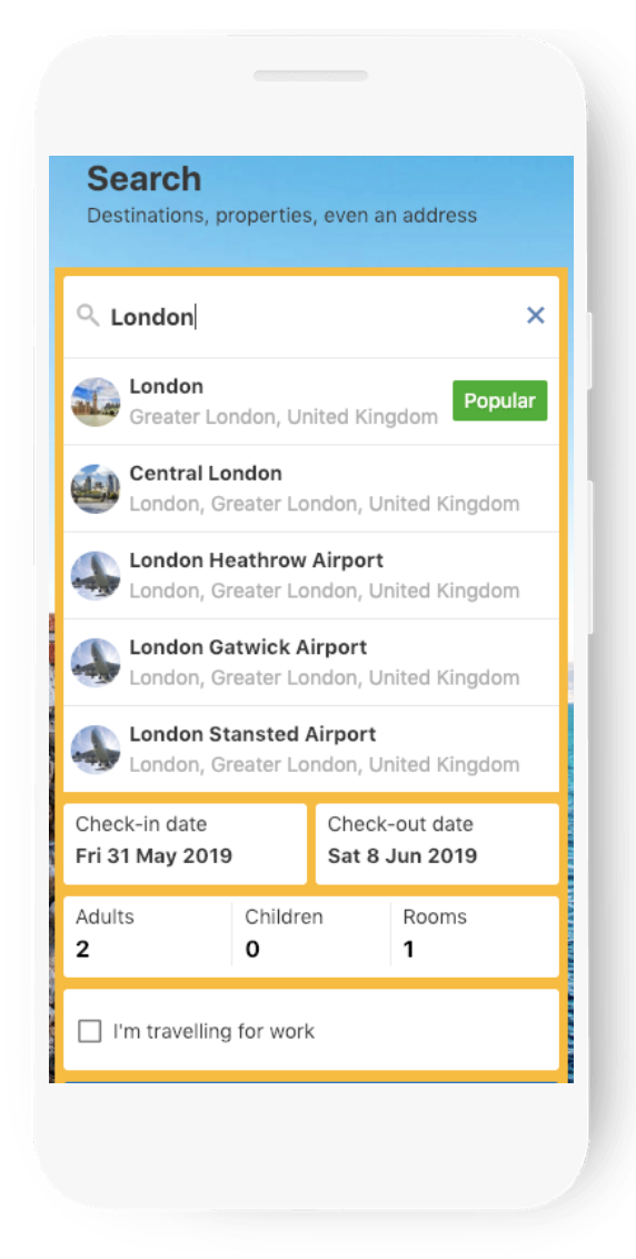
- Subcategories: Users are offered subcategory choices at the point of search. Eg. All London airports, Gatwick, Heathrow, etc.
- Later Date: After users select their outbound date, the return calendar defaults to a future date.
- Load More Results: At the foot of search results or category pages, a very prominent ‘Next’ or ‘Load more’ type button is available. Perform a generic search. Scroll to the bottom and look for ‘Next’ (or similar) or infinite scrolling with user control. Small blue link numbers or arrows are a fail.
- Map View: Accommodation options can be viewed as a map as well as a list.
- Calendar View: Calendar view is full width so users can easily move between months.
- Spelling Correction: Autocorrect is used to find the right search term, and its use is clearly indicated.
- Saved Searches: Previous searches are automatically saved, even for users who don’t have an account.
- Next Steps: Users are offered next steps at the bottom of each search results page. Eg. “Back to top”, “Filter”, etc.
- Search Again: After running a search, users can edit the search term or even remove it completely. Eg. with an ‘x’ in the field.
- Search Populated: After running an on-site search, the search field should remain populated.
PRODUCT PAGES
- Key Information: Key information is easy to find and clearly displayed. Eg. cancellation policy, room type, discounts, etc.
- Multiple Filters: Multiple filters can be used at once, without reload. If appropriate, within a single category too. Eg. region.
- Call to Action: Main Call to Actions should be near the product, very prominent, and at most a short scroll from the top of the page.
- Credible Reviews: If user reviews are available they should be credible and easy to find.
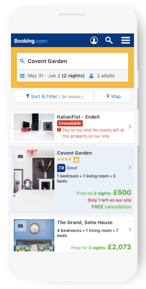
- Availability Data: When a product is out of stock, this is indicated immediately. Where relevant, available sizes are clearly shown.
- Scarcity Principle: When availability is low, users can see in real time how many rooms or seats etc are left.
- Swipeable Images: Where multiple images are used, users can see how many there are and easily move between them. Eg. swiping or tapping.
- Swappable Images: Where useful and appropriate, images have the option to swap colors, fabrics, etc.
- Zoomable Images: All product images should be zoomable without pixelation.
- Easy to Compare: Hotel or other travel details follow a set pattern so users can easily compare. Eg. bullet points.
- Scroll Position: The website remembers a user’s scrolled page positions when moving back to a search results or product listings page.
- Shareable: Users can easily share your product, service or offer via a copyable URL or a Call To Action button. Eg. “Share”
- Recommendation Engine: Upsell prompts such as ‘Complete the look’ (eg. belt with trousers, grout with tiles) are provided.
- Guest Wishlist: Hotel and other travel options can be favorited and saved to a guest wishlist.
- Relevant CTA: The main Call to Action should fit the context. Eg. Key accommodation details page followed by ‘Check Availability’.
REGISTRATION & CONVERSION
- Plenty of Time: When a booking session times out, a countdown is visible throughout the checkout process.
- Account Access: Users can easily start creating an account via any page on the site.
- Quarantined: After the conversion process begins, there are no unnecessary elements or buttons that take users elsewhere.
- Progress Bar: If a form is spread across many pages, progress should be indicated at each step. Eg. checkout flow.
- No Hidden Costs: As early on as possible, prices should include all unavoidable costs. Eg. accommodation taxes.
- Visible Price: The current final price is clearly shown throughout the conversion funnel.
- Time to Pay: With accommodation sites, it should be very clear whether users pay now or when they arrive.
- Form Field Etiquette: Field labels and input boxes are paired, visible simultaneously, and left-justified. Labels also sit above the field.
- Simplified Payments: Simplified payment is offered (Eg. PayPal, Google Pay). Or card scan/autofill is available at checkout.
- Form Fields Explained: Form field requirements are clearly explained.
- Saved Data: In forms, users can navigate back and forth without losing information they’ve already entered.
- Optional Fields: Optional fields are clearly labelled as such.
- Human Help: At any point within office hours, users can get instant and responsive support, such as phone or web chat.
- Benefits Explained: The benefits of opening an account are clearly explained.
- Suggested Content: In address forms, the system makes suggestions based on the user’s postcode or regional equivalent.
- Real-Time Feedback: Any mistakes made in forms are clearly highlighted, with required actions shown in real time.
- Autofill: Autofill is supported for all form fields. Fields are also properly tagged for efficient browser-based autofill.
- Keyword Types: The appropriate keyboard for the field type is shown.
- Selling Points: Selling points are reinforced throughout the conversion funnel. Eg. generous cancellation policy.
- Guest Checkout: Users can book without having to create an account.
- Shopping Cart: When new items are added to the basket, the shopping cart icon should automatically update and show the quantity.
- Free Delivery Top Up: Where applicable, users should be told how much more they need to spend to get free delivery.
MOBILE DESIGN
- Page Design: All pages should align with the brand’s look, feel, colour and logo.
- Consistent Experience: The brand experience is consistent between mobile and desktop sites.
- No New Tabs: Links never open new browser tabs, unless clearly indicated, or users can back arrow to the previous page.
- Legible Labels: All labels and headings are clear and easy to read for smaller screens.
- High Quality Images: All graphics, videos and images used on the site are high-quality but optimized for mobile rendering.
- Landscape Friendly: The mobile design lets users view images and videos in landscape, where appropriate.
- No Pop-Ups: There are no unrequested pop-ups or interstitials.
- Show Activity: When users are waiting, demonstrate activity to reassure them the site hasn’t crashed.
- Secure Site: All pages should be served over HTTPS protocol, not just for Personally Identifiable Information (PII).
- Uncluttered Pages: Landing pages are uncluttered, with clear and well-spaced content.
- Thumb Friendly: Touch targets are large enough for thumbs and easily tappable. Eg. radio button hit area is padded.
- Icons Explained: Icons have text labels or explanations. The exception is search, where a magnifying glass is sufficient.
- Carousels Avoided: Carousels are generally avoided, but acceptable if done well and in moderation.
- Clickable Numbers: If applicable, users can click or tap a phone number to dial it.
- Uses GPS: With accommodation sites, a smartphone’s GPS feature can be used when helpful. Eg. to find nearby hotel.
SPEED
- Page Load Time: Does your page load fast enough to not disrupt the overall experience?
Tools to Improve Your Mobile UX
Thankfully, Google and interwebs don’t leave us hanging and there are tons of reputable tools out there to test, optimize and measure your mobile experience.
DESIGN & DEVELOPMENT
TESTING
OPTIMIZATION
WRAPPING UP
With mobile accounting for the lion’s share of online activity these days, it is crucial that brands get their mobile experiences up to parity. By running your site against this list, brands can quickly identify areas where they are providing the best experiences and areas where they need to improve. With a strategy that considers your user and your business goals, your mobile site should function well and drive users to take an action.
Download the 75 Ways to Optimize your Mobile UX
Need expert help with optimizing your Mobile User Experience and improving your buyers’ journey? Contact Us!


